import numpy as np
import scipy.stats as stats6 Probability and statistics
In this chapter we will show various visualizations and Python basics of concepts we have seen in the course Probability and Statistics (35B402).
More precisely, this chapter consists of two parts: links to interactive applications illustrating concepts and examples seen in class, and Python basics for working with probability distributions and randomly generated data.
Note
This document will be updated throughout the course Probabilisty and Statistics during the academic year 2025/2026.
6.1 Probability distributions
The stats module of SciPy has many built-in probability distributions. Each distribution can be seen as an object on which various methods can be performed (such as accessing its probability density function or summary statistics like the mean and median).
In this section we will focus on continuous probability distributions. SciPy also has many built-in discete probability distributions.
A list of all continuous distributions that are present in the stats module can be found here; they are so-called stats.rv_continuous objects. Assuming that SciPy’s stats package is imported under the alias stats, we can instantiate a distributional object by using stats.dist_name where dist_name is the name of a built-in (continuous) probability distribution in the mentioned list.
Many distributions have input parameters scale and loc that model the scale and location of the distribution, respectively. Depending on the distribution that is considered, these parameters have different meanings.
As an example, the normal distribution has probability density function f(x) = \frac{1}{\sqrt{2\pi\sigma^2} } e^{-\frac{(x-\mu)^2}{2\sigma^2}} which is parameterized by \mu and \sigma.
In Python \mu is the loc parameter, and \sigma the scale parameter. To figure out the function of the scale and loc parameter, you can check the documentation (which can be found here for the Normal distribution).
All distributions have default values for these parameters, which are typically loc=0 and scale = 1.
# Create normal distribution object with mu=0, sigma=1
dist_norm = stats.norm(loc=0, scale=1)Once a distribution object has been instantiated, we can use methods (i.e., functions) to obtain various properties of the distribution, such as its probability density function (pdf), cumulative density function (cdf) and summary statistics such as the mean, variance and median (or, more general, quantiles).
We give a list of some common methods for a distribution object named dist_name. We start with common functions associated with a probability distribution.
dist_name.pdf(x): Value f(x) where f is the pdf of the distribution.dist_name.cdf(x): Value F(x) where F is the cdf of the distribution.
x = 1
print(dist_norm.pdf(x))0.24197072451914337All the above functions are vectorized, meaning here that they can also take one-dimensional Numpy arrays as input, in which case they return the requested value for every element in the array.
x = np.array([1, 3, 5.5])
print(dist_norm.pdf(x)) # Gives probability density function evaluated in x = 1, 3, 5.5[2.41970725e-01 4.43184841e-03 1.07697600e-07]We can also access various summary statistics:
dist_name.mean(): Returns mean of the distributiondist_name.var(): Returns variance of the distributiondist_name.median():Returns median of the distribution
dist_norm = stats.norm(loc=0,scale=2)
mean = dist_norm.mean()
variance = dist_norm.var()
median = dist_norm.median()
print("Mean of the distribution is", mean)
print("Variance of the distribution is", variance)
print("Median of the distribution is", median)Mean of the distribution is 0.0
Variance of the distribution is 4.0
Median of the distribution is 0.0As a final application of density functions, we show how they can be used to compute convolutions.
Insight 3.19: Convolution of three distributions
Following the setting of Insight 3.19 seen in class, let Z = X + Y + U with X \sim \text{LogNormal}(\mu,\sigma^2), Y \sim \text{Exp}(\lambda) and U \sim U(a,b), that is, Z is the sum of a log-normal, exponential and uniform distribution.
The goal is to create for a grid of z-values, the corresponding probability density f_Z(z)-values. Computing convolutions can be done easily with the convolve() function from SciPy’s signal package. In the code below this is done in a two-step approach, which we will first elaborate on.
First, the pdf of W = X + Y, f_{W}(w) = \int_{-\infty}^{\infty}f_X(x)f_Y(w-x) \mathrm{dx}, of the convolution of X and Y is computed for various values of w, and then afterwards the pdf f_Z = F_{(X+Y) + U} as the convolution of W = X+Y and U is computed in a similar way.
Because we cannot compute the integral above analytically, we approximate it by a discrete sum over a finite range of x-values. In the code below, we take the discretized grid D = \{0,001,002,\dots,19.999,20\} of x-values with now the interpretation that \mathrm{dx} = 0.001, so that the discrete approximation becomes f_{X+Y}(w) \approx \sum_{x \in D} f_X(x) f_Y(w-x) \mathrm{dx}.
To quickly compute the grid values, we can use the arange() function from NumPy. For three inputs a, b and \text{step} this function returns a NumPy array with the values [a, a + \text{step}, a + 2\cdot \text{step},\dots, b - \text{step}]. Note that the value of b itself is excluded. Let us illustrate this with an example.
a = 2
b = 5
step = 0.2
x = np.arange(a,b,step)
print(x)[2. 2.2 2.4 2.6 2.8 3. 3.2 3.4 3.6 3.8 4. 4.2 4.4 4.6 4.8]To compute \sum_{x \in D} f_X(x) f_Y(w-x) \mathrm{dx}, we evaluate the probability density function of the distributions of X and Y in the grid points in x in the code below and store these in f_X and f_Y. The function convolve() then computes the quantity
\sum_{x \in D} f_X(x) f_Y(w-x)
for many values of w (explained below). To obtain the approximation for f_{X+Y}(w) we have to multiply this expression by \mathrm{dx}, which can be considered a constant in the discrete approximation.
Because we evaluate f_X and f_Y on the domain D, all the values that the sum W = X + Y can attain are in the set
\{0,001,002,\dots,19.999,20,20.001,\dots,39.999,40.000\}.
The elements in f_W correspond to f_W(w) for the w’s in this set. We compute these w-values as well for completeness.
The above steps are then repeated for the second convolution. The final z-values, for which f_Z(z) has been computed and stored in f_Z, are computed in the array z.
Although this is not a complete description of what is going on in the code below, it does illustrate that convolutions can be numerically computed with relatively small (programming) effort as opposed to a typically hard analysis of the corresponding integral analytically.
import numpy as np
import scipy.stats as stats
from scipy.signal import convolve
# Parameters (as in Insight 3.19)
mu = 0.0
sigma = 0.5
lam = 1.0
a, b = 0.0, 2.0
# Grid D (create with built-in function np.arange())
dx = 0.001
x_max = 20
x = np.arange(0, x_max + dx, dx)
# PDFs
f_X = stats.lognorm.pdf(x, s=sigma, scale=np.exp(mu))
f_Y = stats.expon.pdf(x, scale=1/lam)
f_U = stats.uniform.pdf(x, loc=a, scale=b - a)
# First convolution: W = X + Y.
f_W = convolve(f_X, f_Y, mode="full") * dx
# Corresponding grid for W
w = np.arange(0, len(f_W)) * dx
# Second convolution: Z = (X + Y) + U = W + U:
f_Z = convolve(f_W, f_U, mode="full") * dx
# Corresponding grid for Z
z = np.arange(0, len(f_Z)) * dxIn the code above the final array z contains various values so thatf_Z[i] is the pdf value of Z of the i-th element z[i] in z. We can also visualize the resulting pdf by plotting z against f_Z.
If you want to know more about plotting functions with Python, you can have a look, e.g., here .
Show code generating the plot below
import matplotlib.pyplot as plt
# Plot
plt.figure(figsize=(8, 4))
plt.plot(z, f_Z, label="PDF of Z = X + Y + U")
plt.xlim(0, 15)
plt.xlabel("z")
plt.ylabel("Density")
plt.legend()
plt.grid()
plt.show()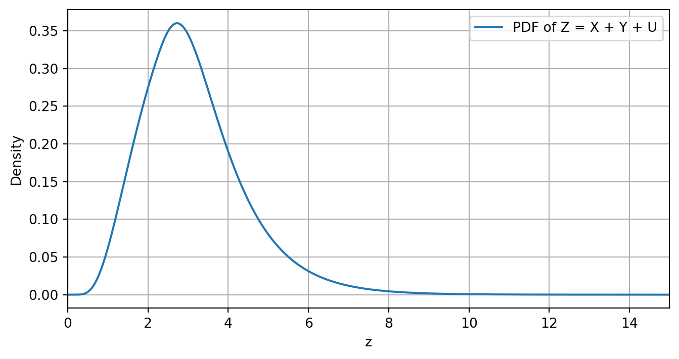
6.2 Interactive visualizations
In this section we present various interactive visualizations that were demonstrated in class. Note that every example also contains a link to a stand-alone website with the application, in case this notebook does not format them well on your device.
These applications have been constructed using Python’s Vega-Altair package. You can access the code of all applications as well by clicking on the “Show code generating the plot below” button.
You can copy this code into a Jupyter notebook to run it yourself (although the sliders might appear at a different point in the figure). Furthermore, you might need to run the following line in the Anaconda prompt (if you are using Python via the Anaconda installation) so that the line alt.data_transformers.enable("vegafusion") in some codes does not raise an error.
conda install -c conda-forge vegafusion vl-convert-pythonExample 2.33
In this section we provide an interactive application for the visualization of the bivariate Normal distribution. This tool gives the option to vary the covariance matrix entries in four different ways (each with their own characteristic). You can also control which probability contour is plotted.
The means are fixed at \mu_X = 5 and \mu_Y = 50. The reason these cannot be varied is because this only give rise to a linear translation of the elements in the application, which is mathematically not interesting.
If the app is not well-formatted on your device, you can also find it here.
Show code generating the plot below
import pandas as pd
import numpy as np
import altair as alt
from scipy.stats import chi2
# For Altair to handle large dataframes
alt.data_transformers.enable("vegafusion")
# Fixed mean values
mu_x = 5
mu_y = 50
# -----------------------------
# Interactive sliders
# -----------------------------
# Values of p for probability contours
p_values = np.arange(0.05, 1.0, 0.05)
# Slider for probability p
p_slider = alt.param(
name="p",
value=0.95,
bind=alt.binding_range(min=p_values.min(),
max=p_values.max(),
step=0.05,
name="Probability contour for p = ")
)
# Different regimes for correlation/covariance
sigma_values = [(4,25,8),
(4,25,-8),
(4,25,0),
(3,6,4)]
# Dropdown menu for sigma regimes
sigma_selector = alt.param(
name="sigma",
value=sigma_values[0], # Set the default value
bind=alt.binding_select(options=sigma_values,
name="Select covariance matrix σₓ, σᵧ, σₓᵧ = ")
)
# -----------------------------
# Initial data frames
# -----------------------------
df_points = pd.DataFrame({
"x": pd.Series(dtype="float64"),
"y": pd.Series(dtype="float64"),
"name": pd.Series(dtype="string"),
"sigma": pd.Series(dtype="object"),
})
df_line = pd.DataFrame({
"x": pd.Series(dtype="float64"),
"y": pd.Series(dtype="float64"),
"name": pd.Series(dtype="string"),
"sigma": pd.Series(dtype="object"),
})
df_ellipses = pd.DataFrame({
"x": pd.Series(dtype="float64"),
"y": pd.Series(dtype="float64"),
"p": pd.Series(dtype="float64"),
"theta": pd.Series(dtype="float64"),
"name": pd.Series(dtype="string"),
"sigma": pd.Series(dtype="object"),
})
# -----------------------------
# Create data for frames
# -----------------------------
for sigmas in sigma_values:
sigma_x = sigmas[0]
sigma_y = sigmas[1]
sigma_xy = sigmas[2]
# Means and covariance
mu = np.array([mu_x, mu_y])
Sigma = np.array([[sigma_x, sigma_xy],
[sigma_xy, sigma_y]])
# Random data
np.random.seed(42)
data = np.random.multivariate_normal(mu, Sigma, size=500)
data_x, data_y = data[:,0], data[:,1]
# Correlation line
corr = np.corrcoef(data_x, data_y)[0,1]
slope = corr * (np.std(data_y)/np.std(data_x))
intercept = np.mean(data_y) - slope * np.mean(data_x)
x_line = np.linspace(np.min(data_x), np.max(data_x), 100)
y_line = intercept + slope * x_line
df_points_new = pd.DataFrame({"x": data_x,
"y": data_y,
"name": "Generated data (points)",
"sigma" : [sigmas] * len(data_x)})
df_points = pd.concat([df_points, df_points_new],ignore_index=True)
df_line_new = pd.DataFrame({"x": x_line,
"y": y_line,
"name": "Correlation (line)",
"sigma" : [sigmas] * len(x_line)})
df_line = pd.concat([df_line, df_line_new],ignore_index=True)
# Precompute ellipses for all p
def probability_ellipse(mu, Sigma, p, n_points=200):
c = chi2.ppf(p, df=2)
vals, vecs = np.linalg.eigh(Sigma)
axes = np.sqrt(vals * c)
theta = np.linspace(0, 2*np.pi, n_points)
ellipse = vecs @ np.vstack([axes[0]*np.cos(theta), axes[1]*np.sin(theta)])
ellipse[0] += mu[0]
ellipse[1] += mu[1]
return pd.DataFrame({"x": ellipse[0],
"y": ellipse[1],
"theta": theta,
"p": p,
"name": "Probability contour (ellipse)",
"sigma" : [sigmas] * len(ellipse[0])}).sort_values("theta")
df_ellipses_new = pd.concat([probability_ellipse(mu, Sigma, p) for p in p_values])
df_ellipses = pd.concat([df_ellipses, df_ellipses_new],ignore_index=True)
# -----------------------------
# Create the visualization
# -----------------------------
# Define the domain limits
x_min, x_max = -2, 12
y_min, y_max = 30, 70
# Info for legend
color_legend=alt.Scale(domain=["Generated data (points)",
"Correlation (line)",
"Probability contour (ellipse)"],
range=["grey", "red", "blue"])
# Filter points within domain
df_points_filtered = df_points[
(df_points["x"] >= x_min) & (df_points["x"] <= x_max) &
(df_points["y"] >= y_min) & (df_points["y"] <= y_max)
]
# Now use df_points_filtered for the data points
points = alt.Chart(df_points_filtered).transform_filter(
(alt.datum.sigma[0] == sigma_selector[0]) & # Match with selected sigma regime
(alt.datum.sigma[1] == sigma_selector[1]) &
(alt.datum.sigma[2] == sigma_selector[2])
).mark_circle(size=40, opacity=0.5).encode(
x="x:Q", y="y:Q",
color=alt.Color("name:N",
scale=color_legend,
legend=alt.Legend(title="Element type"))
)
# Line can also be filtered
df_line_filtered = df_line[
(df_line["x"] >= x_min) & (df_line["x"] <= x_max) &
(df_line["y"] >= y_min) & (df_line["y"] <= y_max)
]
line = alt.Chart(df_line_filtered).transform_filter(
(alt.datum.sigma[0] == sigma_selector[0]) &
(alt.datum.sigma[1] == sigma_selector[1]) &
(alt.datum.sigma[2] == sigma_selector[2])
).mark_line(strokeWidth=2).encode(
x="x:Q",
y="y:Q",
color=alt.Color("name:N",
scale=color_legend,
legend=alt.Legend(title="Element type"))
)
# Ellipse can be filtered similarly
df_ellipses_filtered = df_ellipses[
(df_ellipses["x"] >= x_min) & (df_ellipses["x"] <= x_max) &
(df_ellipses["y"] >= y_min) & (df_ellipses["y"] <= y_max)
]
ellipse = alt.Chart(df_ellipses_filtered).transform_filter(
(alt.datum.p - p_slider) ** 2 < 1e-6,
(alt.datum.sigma[0] == sigma_selector[0]) &
(alt.datum.sigma[1] == sigma_selector[1]) &
(alt.datum.sigma[2] == sigma_selector[2])
).mark_line(strokeDash=[5,5]).encode(
x="x:Q", y="y:Q", order="theta",
color=alt.Color("name:N",
scale=color_legend,
legend=alt.Legend(title="Element type"))
)
# Combine charts
chart = (points + line + ellipse).add_params(sigma_selector,p_slider).encode(
x=alt.X("x:Q", scale=alt.Scale(domain=[x_min, x_max])),
y=alt.Y("y:Q", scale=alt.Scale(domain=[y_min, y_max]))
).properties(width=500, height=350,
title={"text": {
"expr":
"'Bivariate Normal distribution with probability contour for p = ' + format(p, \".2f\")"},
"anchor": "middle"
}
)
chartExample 2.50
Here we give an interactive visualization of Example 2.50 illustrating the tail behaviour of the Gamma(\alpha,\beta)-Mixed Poisson distribution as \alpha varies.
If the app is not well-formatted on your device, you can also find it here.
Show code generating the plot below
import numpy as np
import pandas as pd
import altair as alt
from scipy.stats import nbinom
# -----------------------------
# Parameters
# -----------------------------
k2 = np.arange(0, 31)
beta_nb = 1.0
p_nb = beta_nb / (beta_nb + 1)
# Range of alpha values for slider
alpha_values = np.arange(1.0, 15.1, 0.5)
# -----------------------------
# Build DataFrame
# -----------------------------
rows = []
for alpha in alpha_values:
pmf = nbinom(n=alpha, p=p_nb).pmf(k2)
tail = 1 - nbinom(n=alpha, p=p_nb).cdf(k2 - 1)
for k, p, t in zip(k2, pmf, tail):
rows.append({
"k": k,
"value": p,
"type": "PMF",
"alpha": alpha
})
if k > 0: # avoid log(0)
rows.append({
"k": k,
"value": t,
"type": "Tail",
"alpha": alpha
})
df = pd.DataFrame(rows)
# -----------------------------
# Slider parameter
# -----------------------------
alpha_slider = alt.param(
name="alpha",
value=5.0,
bind=alt.binding_range(
min=alpha_values.min(),
max=alpha_values.max(),
step=1,
name=r"Dispersion control value α = "
)
)
slider_chart = (
alt.Chart(pd.DataFrame({"x": [0]}))
.add_params(alpha_slider)
.mark_point(opacity=0)
.properties(
height=10,
title=" "
)
)
# -----------------------------
# PMF plot
# -----------------------------
pmf_chart = (
alt.Chart(df[df["type"] == "PMF"])
.transform_filter(alt.datum.alpha == alpha_slider)
.mark_line(interpolate="step-after", strokeWidth=2, color="blue")
.encode(
x=alt.X("k:Q", title=r"k",scale=alt.Scale(domain=[0, 30]),
axis=alt.Axis(
titleFontSize=15,
titleFontWeight='lighter')),
y=alt.Y("value:Q", title=r"P(X = x)",scale=alt.Scale(domain=[0, 0.5]),
axis=alt.Axis(
titleFontSize=15,
titleFontWeight='lighter')
)
)
.properties(
title={"text": {
"expr": "'Gamma(α=' + alpha + ',β=1)-Mixed Poisson (Negative Binomial)'"
},
"anchor": "middle"
},
width=225,
height=200
)
)
# -----------------------------
# Tail probability plot (log-log)
# -----------------------------
tail_chart = (
alt.Chart(df[df["type"] == "Tail"])
.transform_filter(alt.datum.alpha == alpha_slider)
.mark_line(strokeWidth=2, color="blue")
.encode(
x=alt.X("k:Q", title=r"k", scale=alt.Scale(type="log"),axis=alt.Axis(
titleFontSize=15,
titleFontWeight='lighter',
)),
y=alt.Y(
"value:Q",
scale=alt.Scale(type="log", domain=[1e-9, 1]),
title=r"P(X ≥ x)",
axis=alt.Axis(
titleFontSize=15,
titleFontWeight='lighter',
)
)
)
.properties(
title={"text": {
"expr": "'Corresponding tail probability (Negative Binomial)'"
},
"anchor": "middle"
},
width=225,
height=200
)
)
# -----------------------------
# Final layout
# -----------------------------
final_chart = alt.vconcat(
slider_chart,
pmf_chart | tail_chart
)
final_chartExample 4.18
Here we show the convergence of a standardized Gamma(k,1) distribution to a Normal distribution as k increases.
If the app is not well-formatted on your device, you can also find it here.
Show code generating the plot below
import numpy as np
import pandas as pd
import altair as alt
from scipy import stats
alt.data_transformers.enable("vegafusion")
# -----------------------------
# Slider values
# -----------------------------
k_values = np.arange(2, 100, 1) # integer k from 1 to 15
lam = 1.0 # lambda parameter
# x-axis for standardized values
x = np.linspace(-3, 3, 100)
# -----------------------------
# Build long-form DataFrames for all k values
# -----------------------------
rows_pdf = []
rows_cdf = []
for k_slider in k_values:
# Gamma distribution
gamma_dist = stats.gamma(a=k_slider, scale=1/lam)
mu = gamma_dist.mean()
sigma = gamma_dist.std()
gamma_pdf = gamma_dist.pdf(mu + sigma * x) * sigma
gamma_cdf = gamma_dist.cdf(mu + sigma * x)
# Standard Normal reference
normal_pdf = stats.norm.pdf(x)
normal_cdf = stats.norm.cdf(x)
# PDF rows
for xi, gpdf, npdf in zip(x, gamma_pdf, normal_pdf):
rows_pdf.append({"x": xi, "value": gpdf, "distribution": "Standardized Gamma", "k_slider": k_slider})
rows_pdf.append({"x": xi, "value": npdf, "distribution": "Normal(0,1)", "k_slider": k_slider})
# CDF rows
for xi, gcdf, ncdf in zip(x, gamma_cdf, normal_cdf):
rows_cdf.append({"x": xi, "value": gcdf, "distribution": "Standardized Gamma", "k_slider": k_slider})
rows_cdf.append({"x": xi, "value": ncdf, "distribution": "Normal(0,1)", "k_slider": k_slider})
df_pdf = pd.DataFrame(rows_pdf)
df_cdf = pd.DataFrame(rows_cdf)
# -----------------------------
# Slider parameter
# -----------------------------
k_slider_param = alt.param(
name="k",
value=5,
bind=alt.binding_range(min=k_values.min(),
max=k_values.max(),
step=1,
name=r"Value k = ")
)
slider_chart = (
alt.Chart(pd.DataFrame({"x": [0]}))
.add_params(k_slider_param)
.mark_point(opacity=0)
.properties(height=10)
)
# -----------------------------
# PDF chart
# -----------------------------
pdf_chart = (
alt.Chart(df_pdf)
.transform_filter(alt.datum.k_slider == k_slider_param)
.mark_line()
.encode(
x=alt.X("x", scale=alt.Scale(domain=[-3, 3]), title="x",axis=alt.Axis(
titleFontSize=15, # Size
titleFontWeight='lighter')),
y=alt.Y("value", scale=alt.Scale(domain=[-0.05, 0.6]), title="f(x)", axis=alt.Axis(
titleFontSize=15, # Size
titleFontWeight='lighter')),
color=alt.Color("distribution:N", legend=alt.Legend(title="Distribution"))
)
.properties(width=225, height=200, title="Probability Density Function")
)
# -----------------------------
# CDF chart
# -----------------------------
cdf_chart = (
alt.Chart(df_cdf)
.transform_filter(alt.datum.k_slider == k_slider_param)
.mark_line()
.encode(
x=alt.X("x", scale=alt.Scale(domain=[-3, 3]), title="x",axis=alt.Axis(
titleFontSize=15, # Size
titleFontWeight='lighter')),
y=alt.Y("value", scale=alt.Scale(domain=[-0.05, 1]), title="F(x)",axis=alt.Axis(
titleFontSize=15, # Size
titleFontWeight='lighter')),
color=alt.Color("distribution:N", legend=alt.Legend(title="Distribution"))
)
.properties(width=225, height=200, title="Cumulative Density Function")
)
# -----------------------------
# Combine slider + charts
# -----------------------------
final_chart = alt.vconcat(
slider_chart,
pdf_chart | cdf_chart
).properties(title={
"text": {
"expr": "'Standardized Gamma(k=' + k + ',1) and Normal(0,1) distribution'"
},
"anchor": "middle"
})
final_chartExample 4.28
Here we show convergence of the standardized sum of Poisson(1) random variables to a Normal distribution. Note that this concerns “convergence” of a discrete distribution to a continuous distribution.
If the app is not well-formatted on your device, you can also find it here.
Show code generating the plot below
import numpy as np
import pandas as pd
import altair as alt
from scipy import stats
# alt.data_transformers.enable("vegafusion")
# -----------------------------
# Slider values
# -----------------------------
k_values = np.arange(1, 50, 1)
# -----------------------------
# Build DataFrames separately
# -----------------------------
rows_pois = []
rows_norm = []
for k in k_values:
# --- Poisson sum ---
pois_dist = stats.poisson(mu=k)
multiple = 4 # This value should be the same as the x_range later one;
# otherwise there are also x-values outside the plotted range
# which makes the legend jump around. This is a rule of thumb, though.
s_vals = np.arange(0, k + multiple * np.sqrt(k)) # Most mass falls in this support
z_vals = (s_vals - k) / np.sqrt(k)
pmf_vals = pois_dist.pmf(s_vals)
bin_width = 1 / np.sqrt(k)
for z, p in zip(z_vals, pmf_vals):
rows_pois.append({
"z": z,
"value": p / bin_width,
"k_slider": k,
"legend": "Standardized Poisson Sum"
})
# --- Normal reference ---
x_range = multiple
x = np.linspace(-x_range, x_range, 100)
normal_pdf = stats.norm.pdf(x)
for xi, yi in zip(x, normal_pdf):
rows_norm.append({
"z": xi,
"value": yi,
"k_slider": k,
"legend": "Normal(0,1)"
})
df_pois = pd.DataFrame(rows_pois)
df_norm = pd.DataFrame(rows_norm)
# -----------------------------
# Slider parameter
# -----------------------------
k_slider_param = alt.param(
name="k",
value=1,
bind=alt.binding_range(
min=k_values.min(),
max=k_values.max(),
step=1,
name="Value k = "
)
)
slider_chart = (
alt.Chart(pd.DataFrame({"x": [0]}))
.add_params(k_slider_param)
.mark_point(opacity=0)
.properties(height=0)
)
# -----------------------------
# Common legend properties
# -----------------------------
color_encoding = alt.Color(
"legend:N",
scale=alt.Scale(
domain=["Standardized Poisson Sum", "Normal(0,1)"],
range=["pink", "blue"]
),
legend=alt.Legend(title="Distribution", orient="right")
)
# -----------------------------
# Poisson bars
# -----------------------------
# Define the width calculation
pmf_chart = (
alt.Chart(df_pois)
.transform_filter(alt.datum.k_slider == k_slider_param) # Filter based on slider value
.mark_bar(opacity=0.7,width= 25 * k_slider_param ** (-0.5)) # Set heuristically by inspection
.encode(
x=alt.X("z:Q", title="Standardized value", scale=alt.Scale(domain=[-x_range, x_range]),
axis=alt.Axis(
titleFontSize=15, # Size
titleFontWeight='lighter')),
y=alt.Y("value:Q", title=r"Density",
axis=alt.Axis(
titleFontSize=15, # Size
titleFontWeight='lighter')), # Amount of bold face
color=color_encoding
)
)
# -----------------------------
# Normal line
# -----------------------------
normal_curve = (
alt.Chart(df_norm)
.transform_filter(alt.datum.k_slider == k_slider_param)
.mark_line(size=3)
.encode(
x=alt.X("z:Q", scale=alt.Scale(domain=[-x_range,x_range])),
y="value:Q",
color=color_encoding
)
)
# -----------------------------
# Final chart
# -----------------------------
final_chart = alt.vconcat(
slider_chart,
(pmf_chart + normal_curve).properties(
title={
"text": {
"expr": "'Standardized sum of k = ' + k + ' Poisson(1) variables'"
},
"anchor": "middle"
}, width=350, height=300
)
)
final_chartExample 4.29
Here we show the convergence of the sum of bimodal PDFs to a Normal distribution with the same mean and variance.
If the app is not well-formatted on your device, you can also find it here.
Show code generating the plot below
import numpy as np
import pandas as pd
import altair as alt
from scipy.signal import convolve
alt.data_transformers.enable("vegafusion")
def bimodal_pdf(x, mu1, sigma1, mu2, sigma2, w1, w2):
"""Compute a bimodal PDF as a weighted sum of two normal distributions."""
pdf1 = (1 / (np.sqrt(2 * np.pi) * sigma1)) * np.exp(-0.5 * ((x - mu1) / sigma1) ** 2)
pdf2 = (1 / (np.sqrt(2 * np.pi) * sigma2)) * np.exp(-0.5 * ((x - mu2) / sigma2) ** 2)
return w1 * pdf1 + w2 * pdf2
def compute_convolution(pdf1, pdf2, dx):
"""Compute the convolution of two PDFs and normalize the result."""
conv = convolve(pdf1, pdf2, mode='full') * dx
return conv / np.sum(conv * dx)
# Parameters for the bimodal distribution
mu1, sigma1 = 2.0, 0.5
mu2, sigma2 = 6.0, 1.0
w1, w2 = 0.5, 0.5
# Compute mean and variance of the bimodal distribution
mu_bimodal = w1 * mu1 + w2 * mu2
var_bimodal = w1 * (sigma1**2 + mu1**2) + w2 * (sigma2**2 + mu2**2) - mu_bimodal**2
sigma_bimodal = np.sqrt(var_bimodal)
# Initial x range and PDF (wide enough)
x = np.linspace(-5, 25, 100)
dx = x[1] - x[0]
y = bimodal_pdf(x, mu1, sigma1, mu2, sigma2, w1, w2)
# DataFrames for Altair plotting
df_list = []
df_normal_list = []
# n values
n_values = np.arange(1, 21, 1)
for n in n_values:
pdf_n = y.copy()
x_n = x.copy()
# Perform (n-1) convolutions
for _ in range(n - 1):
x_n_new = np.linspace(x_n[0] + x[0], x_n[-1] + x[-1], len(pdf_n) + len(y) - 1)
pdf_n = compute_convolution(pdf_n, y, dx)
x_n = x_n_new
# Compute cumulative sum for approximate CDF
cdf_n = np.cumsum(pdf_n) * dx
# Determine 0.01 and 0.99 quantiles
x_min = np.interp(0.0001, cdf_n, x_n)
x_max = np.interp(0.9999, cdf_n, x_n)
# Mask to keep only points in [x_min, x_max]
mask = (x_n >= x_min) & (x_n <= x_max)
x_n_trim = x_n[mask]
pdf_n_trim = pdf_n[mask]
# Add bimodal convolution data
for xi, pi in zip(x_n_trim, pdf_n_trim):
df_list.append({"x": xi, "PDF of bimodal sum": pi, "n": n, "legend": "Sum of Bimodal PDFs"})
# Normal approximation data (same x-range)
mu_normal = n * mu_bimodal
sigma_normal = np.sqrt(n) * sigma_bimodal
pdf_normal = (1 / (np.sqrt(2 * np.pi) * sigma_normal)) * np.exp(-0.5 * ((x_n_trim - mu_normal) / sigma_normal) ** 2)
for xi, pi in zip(x_n_trim, pdf_normal):
df_normal_list.append({"x": xi, "PDF of bimodal sum": pi, "n": n, "legend": "Normal with same mean/variance"})
# Convert to DataFrames
df = pd.DataFrame(df_list)
df_normal = pd.DataFrame(df_normal_list)
# Slider
n_selector = alt.param(
name="n",
value=1,
bind=alt.binding_range(min=n_values.min(),
max=n_values.max(),
step=1,
name="Value n = ")
)
# -----------------------------
# Common legend properties
# -----------------------------
color_encoding = alt.Color(
"legend:N",
scale=alt.Scale(
domain=["Sum of Bimodal PDFs", "Normal with same mean/variance"],
range=["pink", "blue"]
),
legend=alt.Legend(title="Distribution", orient="right")
)
# Altair plot
chart_bimodal = alt.Chart(df).add_params(n_selector).transform_filter(
alt.datum.n == n_selector
).mark_area(opacity=0.3).encode(
x='x:Q',
y='PDF of bimodal sum:Q',
color=color_encoding
)
chart_normal = alt.Chart(df_normal).transform_filter(
alt.datum.n == n_selector
).mark_line(strokeDash=[5,2]).encode(
x='x:Q',
y='PDF of bimodal sum:Q',
color=color_encoding
)
(chart_bimodal + chart_normal).properties(
title={"text":{"expr":"'Sum of n = ' + n + ' bimodal PDFs'"},"anchor":"middle"}, width=350, height=300
)6.3 Examples Chapter 7
Here we provide Python implementations of the examples in Chapter 7 of the Probability and Statistics lecture notes. We often provide two implementations. First, we provide an implementation that closely follows the (pseudo-)code from the lecture notes. Second, we provide an interactive version where you can change one or more of the parameters of the problem. The second version moreover uses a more efficient implementation, for instance using vectorized computation whenever possible.
6.3.1 Example 7.1: Monte Carlo Estimation of pi
Python code 7.6:
Show code generating the plot below
import pandas as pd
import numpy as np
import altair as alt
# Allow large datasets
alt.data_transformers.enable("vegafusion")
# -----------------------------
# Slider values
# -----------------------------
n_samples = np.arange(100, 1000, 100)
n_slider = alt.param(
name="n",
value=100,
bind=alt.binding_range(
min=n_samples.min(),
max=n_samples.max(),
step=100,
name="Samples: "
)
)
# -----------------------------
# Generate data
# -----------------------------
dfs = []
for n in n_samples:
u = np.random.uniform(0, 1, n)
v = np.random.uniform(0, 1, n)
x = 2 * u - 1
y = 2 * v - 1
inside = (x**2 + y**2) <= 1
count = np.sum(inside)
pi_estimate = 4 * count / n
df_new = pd.DataFrame({
"x": x,
"y": y,
"n": n,
"inside": inside,
"pi_estimate": pi_estimate
})
dfs.append(df_new)
df_points = pd.concat(dfs, ignore_index=True)
# -----------------------------
# Circle
# -----------------------------
theta = np.linspace(0, 2*np.pi, 300, endpoint=True)
circle_df = pd.DataFrame({
"x": np.cos(theta),
"y": np.sin(theta),
"theta": theta # <-- critical
})
circle = alt.Chart(circle_df).mark_line().encode(
x="x:Q",
y="y:Q",
order="theta:Q"
)
# -----------------------------
# Points plot
# -----------------------------
points = alt.Chart(df_points).mark_point(size=15).encode(
x=alt.X("x:Q", scale=alt.Scale(domain=[-1, 1])),
y=alt.Y("y:Q", scale=alt.Scale(domain=[-1, 1])),
color=alt.Color("inside:N", title="Inside circle")
).transform_filter(
"datum.n == n"
)
# -----------------------------
# π estimate text
# -----------------------------
text = alt.Chart(df_points).mark_text(
align="left",
baseline="top",
fontSize=24,
fontWeight="bold"
).encode(
x=alt.value(10),
y=alt.value(10),
text=alt.Text("pi_estimate:Q", format=".5f")
).transform_filter(
"datum.n == n"
).transform_aggregate(
pi_estimate="mean(pi_estimate)"
)
# -----------------------------
# Combine chart
# -----------------------------
chart = (
(points + circle + text)
.add_params(n_slider)
.properties(
width=500,
height=500,
title="Monte Carlo Estimation of π:"
)
)
chartInteractive version with confidence intervals.
Show code generating the plot below
import pandas as pd
import numpy as np
import altair as alt
alt.data_transformers.enable("vegafusion")
# -----------------------------
# Slider
# -----------------------------
n_samples = np.arange(100, 4100, 100)
n_slider = alt.param(
name="n",
value=100,
bind=alt.binding_range(
min=n_samples.min(),
max=n_samples.max(),
step=100,
name="Samples: "
)
)
# -----------------------------
# Generate data
# -----------------------------
dfs_points = []
summary = []
for n in n_samples:
u = np.random.uniform(0, 1, n)
v = np.random.uniform(0, 1, n)
x = 2*u - 1
y = 2*v - 1
inside = (x**2 + y**2) <= 1
count = np.sum(inside)
p_hat = count / n
pi_hat = 4 * p_hat
# Standard error
se = 4 * np.sqrt(p_hat * (1 - p_hat) / (n-1))
ci_low = pi_hat - 1.96 * se
ci_high = pi_hat + 1.96 * se
dfs_points.append(pd.DataFrame({
"x": x,
"y": y,
"n": n,
"inside": inside
}))
summary.append({
"n": n,
"pi_hat": pi_hat,
"ci_low": ci_low,
"ci_high": ci_high
})
df_points = pd.concat(dfs_points, ignore_index=True)
df_summary = pd.DataFrame(summary)
# -----------------------------
# Circle
# -----------------------------
theta = np.linspace(0, 2*np.pi, 300, endpoint=True)
circle_df = pd.DataFrame({
"x": np.cos(theta),
"y": np.sin(theta),
"theta": theta
})
circle = alt.Chart(circle_df).mark_line(color="black").encode(
x="x:Q",
y="y:Q",
order="theta:Q"
)
# -----------------------------
# Scatter plot
# -----------------------------
points = alt.Chart(df_points).mark_point(size=15).encode(
x=alt.X("x:Q", scale=alt.Scale(domain=[-1, 1])),
y=alt.Y("y:Q", scale=alt.Scale(domain=[-1, 1])),
color=alt.Color("inside:N", title="Inside circle").legend(orient="left")
).transform_filter(
"datum.n == n"
)
# π text
text = alt.Chart(df_summary).mark_text(
align="left",
baseline="top",
fontSize=24,
fontWeight="bold"
).encode(
x=alt.value(10),
y=alt.value(10),
text=alt.Text("pi_hat:Q", format=".5f")
).transform_filter(
"datum.n == n"
)
scatter_plot = (points + circle + text).properties(
width=400,
height=400,
title="Monte Carlo sampling"
)
# -----------------------------
# Dropdown to toggle CI display
# -----------------------------
ci_toggle = alt.param(
name="show_ci",
value="No", # default: do not show
bind=alt.binding_select(options=["No", "Yes"], name="Show CI: ")
)
# -----------------------------
# Convergence plot layers
# -----------------------------
# Line of pi_hat
line = alt.Chart(df_summary).mark_line().encode(
x="n:Q",
y=alt.Y("pi_hat:Q", scale=alt.Scale(domain=[2.5, 3.5])).title("pi_hat")
)
# Confidence interval area (conditionally shown)
ci_band = alt.Chart(df_summary).mark_area(opacity=0.2).encode(
x="n:Q",
y=alt.Y("ci_low:Q", scale=alt.Scale(domain=[2.5, 3.5])),
y2="ci_high:Q",
).transform_filter(
"show_ci == 'Yes'"
)
# True pi horizontal line
true_pi = alt.Chart(pd.DataFrame({"y": [np.pi]})).mark_rule(color="red").encode(
y=alt.Y("y:Q", scale=alt.Scale(domain=[2.5, 3.5])).title('')
)
# Vertical rule for selected n
rule = alt.Chart(df_summary).mark_rule(color="black").encode(
x="n:Q"
).transform_filter(
"datum.n == n"
)
# Combine layers
convergence_plot = (ci_band + line + true_pi + rule).add_params(
ci_toggle,
n_slider
).properties(
width=400,
height=400,
title="Convergence of π estimate"
)
# -----------------------------
# Combine
# -----------------------------
chart = alt.vconcat(
convergence_plot,
scatter_plot
).add_params(n_slider)
chart6.3.2 Python code 7.10: estimating a probability
We first compute a high-accuracy estimate of p using 100000 samples.
Show code generating the plot below
import numpy as np
# Inputs
n = 100000 # number of samples
a = 1.96 # threshold
# Initialize sum of indicators
indicator_sum = 0
# For loop exactly as in the pseudo -code
for i in range(1, n + 1):
# Generate X_i ˜ N(0, 1)
X_i = np.random.normal(0, 1)
# Compute indicator I_i = 1_{X_i > a}
I_i = 1 if X_i > a else 0
# Accumulate
indicator_sum += I_i
# Compute p _ n
p_hat = indicator_sum / n
print(f"Monte Carlo estimate: p = {p_hat:.4f}")Monte Carlo estimate: p = 0.0247We then explore how this estimate changes when we vary the number of samples and the threshold.
Show code generating the plot below
import pandas as pd
import numpy as np
import altair as alt
alt.data_transformers.enable("vegafusion")
# -----------------------------
# 1) Sliders (n and a)
# -----------------------------
n_steps = 1000
a_steps = 0.2
n_values = np.arange(100, 50100, n_steps)
a_values = np.round(np.arange(0.16, 3.1, a_steps), 2)
n_slider = alt.param(
name="n",
value=1000,
bind=alt.binding_range(
min=n_values.min(),
max=n_values.max(),
step=n_steps,
name="Samples: "
)
)
a_slider = alt.param(
name="a",
value=1.96,
bind=alt.binding_range(
min=a_values.min(),
max=a_values.max(),
step=a_steps,
name="Threshold a: "
)
)
# -----------------------------
# 2) Generate ONE sample
# -----------------------------
N_max = n_values.max()
X = np.random.normal(0, 1, N_max)
# -----------------------------
# 3) Precompute indicator matrix + cumulative sums
# -----------------------------
# Indicator matrix: shape (N_max, len(a_values))
indicator_matrix = (X[:, None] > a_values[None, :]).astype(int)
# Cumulative sums along rows: S_n(a)
cum_sums = np.cumsum(indicator_matrix, axis=0)
# -----------------------------
# 4) Build summary dataframe (p_hat)
# -----------------------------
summary = []
for j, a in enumerate(a_values):
S_n = cum_sums[:, j]
for n in n_values:
p_hat = S_n[n - 1] / n
summary.append({
"n": n,
"a": a,
"p_hat": p_hat
})
df_summary = pd.DataFrame(summary)
# -----------------------------
# 5) Lightweight sample dataframe
# -----------------------------
df_points = pd.DataFrame({
"X": X,
"index": np.arange(1, N_max + 1)
})
# -----------------------------
# 6) Histogram (dynamic indicator, bin aligned with a step)
# -----------------------------
hist = alt.Chart(df_points).transform_filter(
"datum.index <= n"
).transform_calculate(
indicator="datum.X > a"
).mark_bar().encode(
x=alt.X(
"X:Q",
bin=alt.Bin(step=0.1) # matches step size of a_values
),
y="count()",
color=alt.Color("indicator:N", title="X > a")
).properties(
width=400,
height=400,
title="Samples from N(0,1)"
)
# -----------------------------
# 7) Display p_hat text
# -----------------------------
text = alt.Chart(df_summary).mark_text(
align="left",
baseline="top",
fontSize=24,
fontWeight="bold"
).encode(
x=alt.value(10),
y=alt.value(10),
text=alt.Text("p_hat:Q", format=".5f")
).transform_filter(
"datum.n == n && datum.a == a"
)
# -----------------------------
# 8) Convergence plot (line + vertical rule)
# -----------------------------
line = alt.Chart(df_summary).mark_line().encode(
x="n:Q",
y=alt.Y("p_hat:Q", title="p_hat")
).transform_filter(
"datum.a == a"
)
rule = alt.Chart(df_summary).mark_rule(color="black").encode(
x="n:Q"
).transform_filter(
"datum.n == n && datum.a == a"
)
convergence_plot = (line + rule).properties(
width=400,
height=400,
title="Convergence of p_hat"
)
# -----------------------------
# 9) Combine charts + attach parameters
# -----------------------------
chart = alt.vconcat(
convergence_plot,
hist + text
).add_params(
n_slider,
a_slider
)
chart6.3.3 Python code 7.13: MC approximation of a transformed distribution
Non-interactive version:
Show code generating the plot below
import numpy as np
import matplotlib.pyplot as plt
# Inputs
n = 10000 # number of samples
g = lambda x: x**2 # transformation g(x)
# Storage for simulated Y values
Y = np.empty(n)
# For loop as in the pseudo-code
for i in range(n):
# Generate X_i ~ U(-2, 2)
X_i = np.random.uniform(-2, 2)
# Compute Y_i = g(X_i)
Y[i] = g(X_i)
# Estimate the PDF of Y using a histogram
plt.hist(Y, bins=50, density=True, alpha=0.7, color="#4a90e2")
plt.title('Monte Carlo approximation of $Y = X^2$, $X \\sim U(-2,2)$')
plt.xlabel('y')
plt.ylabel('Estimated density')
plt.grid(alpha=0.4)
plt.show()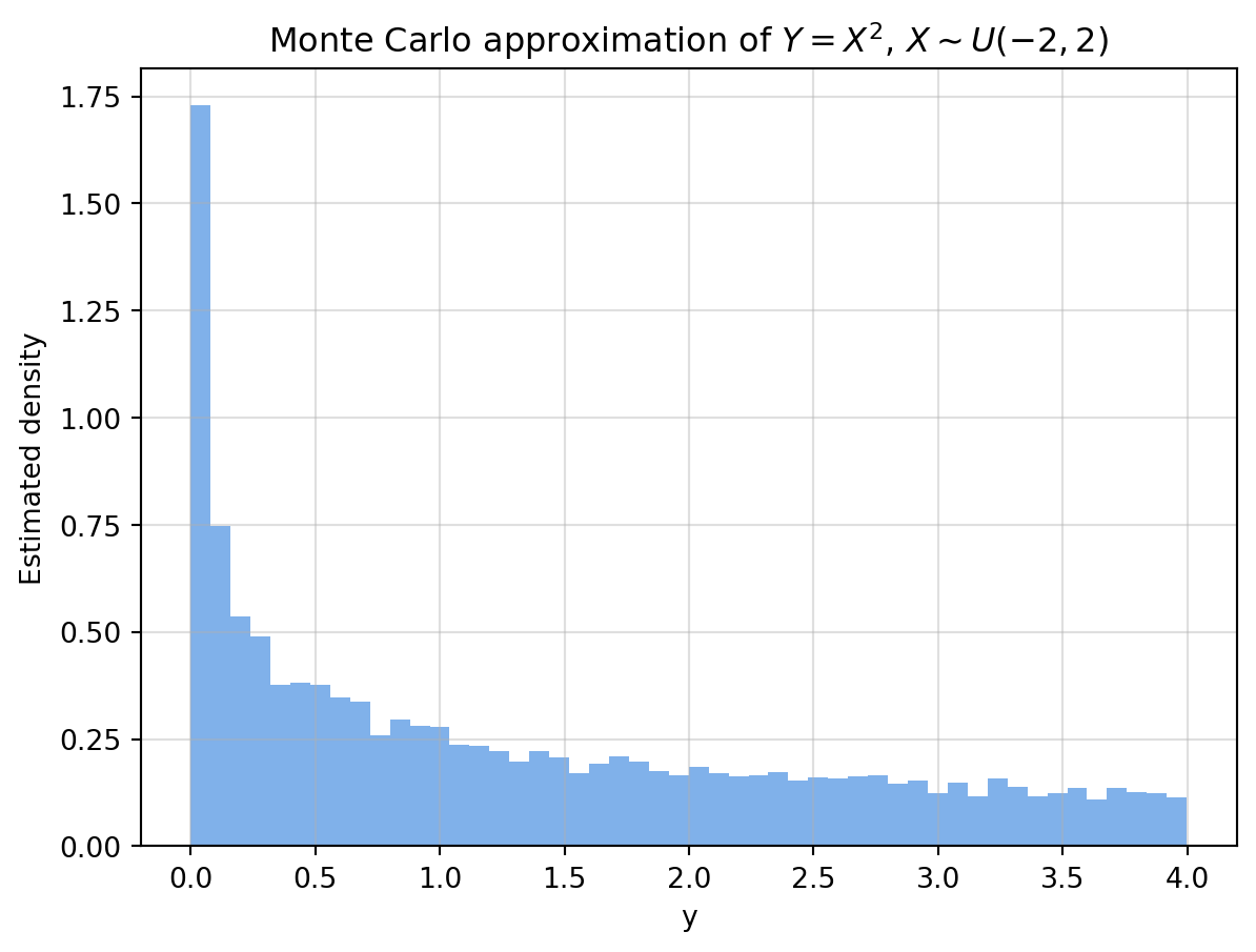
Interactive version:
Show code generating the plot below
import numpy as np
import pandas as pd
import altair as alt
alt.data_transformers.enable("vegafusion")
# -----------------------------
# 1) Slider (number of samples)
# -----------------------------
n_values = np.arange(1000, 101000, 5000)
n_slider = alt.param(
name="n",
value=10_000,
bind=alt.binding_range(
min=n_values.min(),
max=n_values.max(),
step=5000,
name="Samples: "
)
)
# -----------------------------
# 2) Generate maximum sample once
# -----------------------------
N_max = n_values.max()
# X ~ U(-2, 2)
X = np.random.uniform(-2, 2, N_max)
# Transformation Y = g(X) = X^2
Y = X**2
# -----------------------------
# 3) Create dataframe for plotting
# -----------------------------
df = pd.DataFrame({
"X": X,
"Y": Y,
"index": np.arange(1, N_max + 1)
})
# -----------------------------
# 4) Histogram (filtered by slider)
# -----------------------------
hist = alt.Chart(df).transform_filter(
"datum.index <= n"
).mark_bar().encode(
x=alt.X("Y:Q", bin=alt.Bin(maxbins=50), title="Y = X^2"),
y=alt.Y("count()", title="Estimated density")
).properties(
width=500,
height=350,
title="Monte Carlo approximation of Y = X^2, X ~ U(-2,2)"
)
# -----------------------------
# 5) Attach parameter + render
# -----------------------------
chart = hist.add_params(
n_slider
)
chart6.3.4 Python code 7.23: inverse transform sampling (Continuous)
Code from lecture notes:
Show code generating the plot below
import numpy as np
from scipy.stats import norm
def sample_normal_via_inverse(n, mu=0, sigma=1):
"""Efficient vectorized inverse transform sampling."""
u = np.random.uniform(0, 1, n) # Generate all uniforms at once
x = mu + sigma * norm.ppf(u) # Apply inverse CDF elementwise
return x
display(samples = sample_normal_via_inverse(10000, mu=0, sigma=1))Interactive version:
Show code generating the plot below
import numpy as np
import pandas as pd
import altair as alt
from scipy.stats import norm
alt.data_transformers.enable("vegafusion")
# -----------------------------
# 1) Sliders (n and bin width)
# -----------------------------
n_step = 1000
n_values = np.arange(1000, 51000, n_step)
n_slider = alt.param(
name="n",
value=1000,
bind=alt.binding_range(
min=n_values.min(),
max=n_values.max(),
step= n_step,
name="Samples: "
)
)
bin_slider = alt.param(
name="bin_width",
value=0.2,
bind=alt.binding_range(
min=0.01,
max=0.3,
step=0.01,
name="Bin width: "
)
)
# -----------------------------
# 2) Generate data once
# -----------------------------
def sample_normal_via_inverse(n, mu=0, sigma=1):
u = np.random.uniform(0, 1, n)
return mu + sigma * norm.ppf(u)
N_max = n_values.max()
X = sample_normal_via_inverse(N_max)
df = pd.DataFrame({
"X": X,
"index": np.arange(1, N_max + 1)
})
# -----------------------------
# 3) Histogram (dynamic binning + true density)
# -----------------------------
hist = alt.Chart(df).transform_filter(
"datum.index <= n"
).transform_calculate(
# dynamic binning using slider
bin_index="floor(datum.X / bin_width)",
bin_start="datum.bin_index * bin_width",
bin_end="datum.bin_start + bin_width"
).transform_aggregate(
count="count()",
groupby=["bin_start", "bin_end"]
).transform_calculate(
# correct density normalization
density="datum.count / (n * bin_width)"
).mark_bar(opacity=0.6).encode(
x=alt.X("bin_start:Q", bin="binned", title="x"),
x2="bin_end:Q",
y=alt.Y(
"density:Q",
title="Density",
scale=alt.Scale(domain=[0, 0.5]) # fixed axis
)
)
# -----------------------------
# 4) True PDF
# -----------------------------
x_vals = np.linspace(-6, 6, 500)
pdf_df = pd.DataFrame({
"x": x_vals,
"pdf": norm.pdf(x_vals)
})
pdf_line = alt.Chart(pdf_df).mark_line(
color="red",
strokeWidth=2
).encode(
x="x:Q",
y="pdf:Q"
)
# -----------------------------
# 5) Combine
# -----------------------------
chart = (hist + pdf_line).add_params(
n_slider,
bin_slider
).properties(
width=600,
height=400,
title="Inverse Transform Sampling (Normal distribution)"
)
chart6.3.5 Python code 7.26: Inverse transform sampling (Discrete)
Code from the lecture notes:
Show code generating the plot below
import numpy as np
from scipy.stats import binom
def sample_binomial_via_inverse(n, N, p):
"""Generates n samples from Bin(N, p) using inverse transform sampling."""
cdf_vals = binom.cdf(np.arange(0, N+1), N, p) # Step 1: Precompute Binomial CDF
u = np.random.uniform(0, 1, n) # Step 2: Sample from Uniform(0,1)
x = np.searchsorted(cdf_vals, u) # Step 3: Invert CDF
return x
samples = sample_binomial_via_inverse(10000, N=10, p=0.4)Show code generating the plot below
import numpy as np
import pandas as pd
import altair as alt
from scipy.stats import binom
alt.data_transformers.enable("vegafusion")
# -----------------------------
# 1) Slider (number of samples)
# -----------------------------
n_values = np.arange(1000, 101000, 5000)
n_slider = alt.param(
name="n",
value=10_000,
bind=alt.binding_range(
min=n_values.min(),
max=n_values.max(),
step=5000,
name="Samples: "
)
)
# -----------------------------
# 2) Parameters for Binomial
# -----------------------------
N = 10
p = 0.4
# -----------------------------
# 3) Generate maximum sample once
# -----------------------------
def sample_binomial_via_inverse(n, N, p):
cdf_vals = binom.cdf(np.arange(0, N+1), N, p)
u = np.random.uniform(0, 1, n)
return np.searchsorted(cdf_vals, u)
N_max = n_values.max()
X = sample_binomial_via_inverse(N_max, N, p)
df = pd.DataFrame({
"X": X,
"index": np.arange(1, N_max + 1)
})
# -----------------------------
# 4) Empirical PMF (normalized counts)
# -----------------------------
pmf_empirical = alt.Chart(df).transform_filter(
"datum.index <= n"
).transform_aggregate(
count="count()",
groupby=["X"]
).transform_calculate(
prob="datum.count / n"
).mark_bar(opacity=0.6).encode(
x=alt.X("X:O", title="k"),
y=alt.Y(
"prob:Q",
title="Probability",
scale=alt.Scale(domain=[0, 0.5])
)
)
# -----------------------------
# 5) True PMF
# -----------------------------
k_vals = np.arange(0, N+1)
pmf_df = pd.DataFrame({
"k": k_vals,
"pmf": binom.pmf(k_vals, N, p)
})
pmf_true = alt.Chart(pmf_df).mark_point(
color="red",
size=80
).encode(
x=alt.X("k:O"),
y="pmf:Q"
)
# -----------------------------
# 6) Combine
# -----------------------------
chart = (pmf_empirical + pmf_true).add_params(
n_slider
).properties(
width=600,
height=400,
title="Inverse Transform Sampling (Binomial) — Empirical vs True PMF"
)
chart6.3.6 Algorithm 7.29: MC approximation of the convolution
Interactive version (PDF): the convergence plot shows the total variation distance between the histogram with the current number of samples and the histogram with the largest number of samples (which we assume best approximates the true density).
Show code generating the plot below
import numpy as np
import pandas as pd
import altair as alt
alt.data_transformers.enable("vegafusion")
# -----------------------------
# 1) Parameters + controls
# -----------------------------
mu, sigma = 0.0, 0.5
lam = 1.0
a, b = 0.0, 1.0
n_values = np.arange(2000, 52000, 2000)
n_slider = alt.param(
name="n",
value=10_000,
bind=alt.binding_range(
min=n_values.min(),
max=n_values.max(),
step=2000,
name="Samples: "
)
)
# -----------------------------
# 2) Generate data
# -----------------------------
N_max = n_values.max()
X = np.random.lognormal(mean=mu, sigma=sigma, size=N_max)
Y = np.random.exponential(scale=1/lam, size=N_max)
U = np.random.uniform(a, b, size=N_max)
Z = X + Y + U
df = pd.DataFrame({
"z": Z,
"index": np.arange(1, N_max + 1)
})
# -----------------------------
# 3) Empirical PDF
# -----------------------------
bin_width = 0.2
pdf = alt.Chart(df).transform_filter(
"datum.index <= n"
).transform_calculate(
bin_index="floor(datum.z / " + str(bin_width) + ")",
bin_start="datum.bin_index * " + str(bin_width),
bin_end="datum.bin_start + " + str(bin_width)
).transform_aggregate(
count="count()",
groupby=["bin_start", "bin_end"]
).transform_calculate(
density="datum.count / (n * " + str(bin_width) + ")"
).mark_bar(opacity=0.6).encode(
x=alt.X(
"bin_start:Q",
bin="binned",
title="z",
scale=alt.Scale(domain=[0, 14])
),
x2="bin_end:Q",
y=alt.Y("density:Q", title="Density")
).properties(
width=400,
height=400,
title="Empirical PDF"
)
# -----------------------------
# 4) Total variation distance
# -----------------------------
bins = np.linspace(0, 14, 80)
bin_width_tv = bins[1] - bins[0]
ref_hist, _ = np.histogram(Z, bins=bins, density=True)
tv_data = []
for n in n_values:
Zn = Z[:n]
hist_n, _ = np.histogram(Zn, bins=bins, density=True)
tv = 0.5 * np.sum(np.abs(hist_n - ref_hist)) * bin_width_tv
tv_data.append({
"n": n,
"tv": tv
})
df_tv = pd.DataFrame(tv_data)
tv_line = alt.Chart(df_tv).mark_line().encode(
x=alt.X("n:Q", title="n"),
y=alt.Y("tv:Q", title="Total variation distance")
)
rule = alt.Chart(df_tv).mark_rule(color="black").encode(
x="n:Q"
).transform_filter(
"datum.n == n"
)
tv_plot = (tv_line + rule).properties(
width=400,
height=400,
title="Convergence (Total Variation Distance)"
)
# -----------------------------
# 5) Combine
# -----------------------------
chart = alt.vconcat(
tv_plot,
pdf
).add_params(
n_slider
)
chart6.3.7 Example 7.32: LLN in practice: estimating a moment
Algorithm 7.33:
Show code generating the plot below
import numpy as np
# -----------------------------
# Inputs
# -----------------------------
n = 10_000
# Function g(x)
def g(x):
return x**2
# Distribution f_X: standard normal
def sample_X():
return np.random.uniform(0, 1)
# -----------------------------
# Monte Carlo loop
# -----------------------------
sum_Y = 0.0
for i in range(1, n + 1):
# Generate X_i ~ f_X
X_i = sample_X()
# Compute Y_i = g(X_i)
Y_i = g(X_i)
# Accumulate
sum_Y += Y_i
# Sample mean
mu_hat = sum_Y / n
print(f"Monte Carlo estimate: {mu_hat:.5f}")Monte Carlo estimate: 0.32993Interactive version:
Show code generating the plot below
import numpy as np
import pandas as pd
import altair as alt
alt.data_transformers.enable("vegafusion")
# -----------------------------
# 1) Parameters + controls
# -----------------------------
N_max = 10_000
g_selector = alt.param(
name="g_choice",
value="x^2",
bind=alt.binding_select(
options=["x^2", "x^4", "sin(pi x)/2"],
name="g(x): "
)
)
# -----------------------------
# 2) Generate samples once
# -----------------------------
X = np.random.uniform(0, 1, N_max)
# Precompute all g(x)
g_x2 = X**2
g_x4 = X**4
g_sin = np.sin(np.pi * X)/2
df = pd.DataFrame({
"index": np.arange(1, N_max + 1),
"g_x2": g_x2,
"g_x4": g_x4,
"g_sin": g_sin
})
# -----------------------------
# 3) Reshape (long format)
# -----------------------------
df_long = df.melt(
id_vars=["index"],
value_vars=["g_x2", "g_x4", "g_sin"],
var_name="g",
value_name="Y"
)
# Map names to selector labels
df_long["g"] = df_long["g"].map({
"g_x2": "x^2",
"g_x4": "x^4",
"g_sin": "sin(pi x)/2"
})
# -----------------------------
# 4) Running mean (LLN)
# -----------------------------
running_mean = alt.Chart(df_long).transform_filter(
"datum.g == g_choice"
).transform_window(
cumulative_sum="sum(Y)",
sort=[alt.SortField("index")]
).transform_calculate(
mu_hat="datum.cumulative_sum / datum.index"
).mark_line().encode(
x=alt.X("index:Q", title="n"),
y=alt.Y("mu_hat:Q", title="Running mean")
).properties(
width=600,
height=400,
title="Law of Large Numbers (Monte Carlo Estimate)"
)
# -----------------------------
# 5) True expectations
# -----------------------------
true_vals = pd.DataFrame({
"g": ["x^2", "x^4", "sin(pi x)/2"],
"value": [
1.0/3, # E[X^2] for U(0,1)
1.0/5, # E[X^4] for U(0,1)
1.0/np.pi # E[sin(pi*X) for U(0,1)
]
})
true_line = alt.Chart(true_vals).transform_filter(
"datum.g == g_choice"
).mark_rule(color="red").encode(
y="value:Q"
)
# -----------------------------
# 6) Combine
# -----------------------------
chart = (running_mean + true_line).add_params(
g_selector
)
chart6.3.8 Example 7.36: CLT in practice: sampling distribution and confidence bands
Python code 7.38:
Show code generating the plot below
import numpy as np
import matplotlib.pyplot as plt
from scipy.stats import norm
n = 1000 # samples per run
R = 5000 # number of replications
mu_true = 1/3
estimates = [np.mean(np.random.uniform(0, 1, n)**2) for _ in range(R)]
mean_est = np.mean(estimates)
std_est = np.std(estimates, ddof=1)
# Theoretical normal density
x = np.linspace(mean_est - 5*std_est, mean_est + 5*std_est, 300)
pdf = norm.pdf(x, loc=mu_true, scale=std_est)
# 95% confidence interval
ci_low, ci_high = mu_true - 1.96*std_est, mu_true + 1.96*std_est
plt.hist(estimates, bins=40, density=True, alpha=0.7, color="#4a90e2", edgecolor="white")
plt.plot(x, pdf, 'k--', lw=2, label='Normal approx (CLT)')
plt.axvline(ci_low, color='red', linestyle=':', label='95% bounds')
plt.axvline(ci_high, color='red', linestyle=':')
plt.axvline(mu_true, color='black', lw=1, label='True mean (1/3)')
plt.title('Sampling Distribution of Monte Carlo Estimates (CLT)')
plt.xlabel('Monte Carlo estimate $\\hat{\\mu}_n$')
plt.ylabel('Density')
plt.legend(frameon=False)
plt.grid(alpha=0.4)
plt.tight_layout()
plt.show()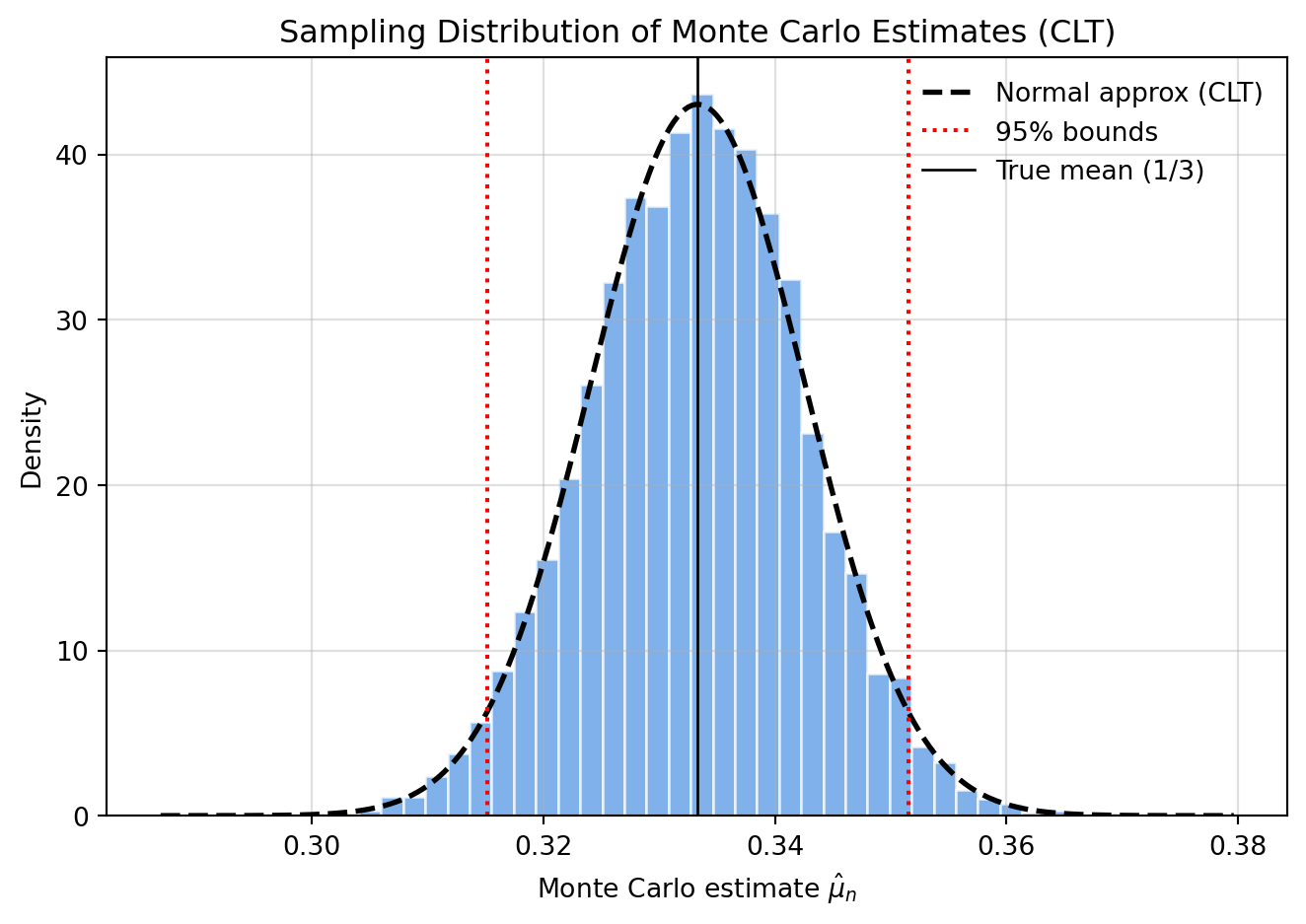
Interactive version with confidence intervals:
Show code generating the plot below
import numpy as np
import pandas as pd
import altair as alt
from scipy.stats import norm
alt.data_transformers.enable("vegafusion")
# -----------------------------
# 1) Parameters + controls
# -----------------------------
n_steps = 500
n_values = np.arange(500, 10500, n_steps)
R = 5000
mu_true = 1/3
n_slider = alt.param(
name="n",
value=500,
bind=alt.binding_range(
min=n_values.min(),
max=n_values.max(),
step=n_steps,
name="Samples per run: "
)
)
# Fixed bin width
bin_width = 0.0025
# -----------------------------
# 2) Precompute Monte Carlo runs
# -----------------------------
records = []
summary = []
for n in n_values:
estimates = [np.mean(np.random.uniform(0, 1, n)**2) for _ in range(R)]
mean_est = np.mean(estimates)
std_est = np.std(estimates, ddof=1)
for val in estimates:
records.append({
"n": n,
"estimate": val
})
summary.append({
"n": n,
"mu_hat": mean_est,
"ci_low": mu_true - 1.96 * std_est,
"ci_high": mu_true + 1.96 * std_est,
"std_est": std_est
})
df = pd.DataFrame(records)
df_summary = pd.DataFrame(summary)
# -----------------------------
# 3) Histogram
# -----------------------------
hist = alt.Chart(df).transform_filter(
"datum.n == n"
).transform_calculate(
bin_index=f"floor(datum.estimate / {bin_width})",
bin_start=f"datum.bin_index * {bin_width}",
bin_end=f"datum.bin_start + {bin_width}"
).transform_aggregate(
count="count()",
groupby=["bin_start", "bin_end"]
).transform_calculate(
density=f"datum.count / ({R} * {bin_width})"
).mark_bar(opacity=0.6).encode(
x=alt.X(
"bin_start:Q",
bin="binned",
scale=alt.Scale(domain=[0.22, 0.44]),
title="μ̂_n"
),
x2="bin_end:Q",
y=alt.Y("density:Q", title="Density")
)
# -----------------------------
# 4) CLT normal curve
# -----------------------------
x_vals = np.linspace(0.22, 0.44, 300)
pdf_records = []
for n in n_values:
std_est = df_summary[df_summary["n"] == n]["std_est"].iloc[0]
for x in x_vals:
pdf_records.append({
"n": n,
"x": x,
"pdf": norm.pdf(x, loc=mu_true, scale=std_est)
})
df_pdf = pd.DataFrame(pdf_records)
pdf_line = alt.Chart(df_pdf).transform_filter(
"datum.n == n"
).mark_line(color="black", strokeDash=[5,5]).encode(
x="x:Q",
y="pdf:Q"
)
# -----------------------------
# 5) True mean + CI (vertical)
# -----------------------------
true_line = alt.Chart(pd.DataFrame({"x":[mu_true]})).mark_rule(color="black").encode(
x="x:Q"
)
ci_lines = alt.Chart(df_summary).transform_filter(
"datum.n == n"
).mark_rule(color="red", strokeDash=[2,2]).encode(
x="ci_low:Q"
) + alt.Chart(df_summary).transform_filter(
"datum.n == n"
).mark_rule(color="red", strokeDash=[2,2]).encode(
x="ci_high:Q"
)
hist_plot = (hist + pdf_line + true_line + ci_lines).properties(
width=400,
height=400,
title="Sampling Distribution (CLT)"
)
# -----------------------------
# 6) Convergence plot
# -----------------------------
y_scale = alt.Scale(domain=[0.22, 0.44])
line = alt.Chart(df_summary).mark_line().encode(
x="n:Q",
y=alt.Y("mu_hat:Q", title="μ̂_n", scale=y_scale)
)
ci_band = alt.Chart(df_summary).mark_area(opacity=0.2).encode(
x="n:Q",
y=alt.Y("ci_low:Q", scale=y_scale),
y2="ci_high:Q"
)
true_rule = alt.Chart(pd.DataFrame({"y":[mu_true]})).mark_rule(color="black").encode(
y=alt.Y("y:Q", scale=y_scale)
)
rule = alt.Chart(df_summary).mark_rule(color="black").encode(
x="n:Q"
).transform_filter(
"datum.n == n"
)
conv_plot = (ci_band + line + true_rule + rule).properties(
width=400,
height=400,
title="Convergence of μ̂_n"
)
# -----------------------------
# 7) Combine
# -----------------------------
chart = alt.vconcat(
conv_plot,
hist_plot
).add_params(
n_slider
)
chart6.3.9 Example 7.44: Monte Carlo Precision and Confidence Intervals for Expectation of e^X
Algorithm 7.45
Show code generating the plot below
import numpy as np
from scipy.stats import norm
# -----------------------------
# Inputs
# -----------------------------
n = 10_000
alpha = 0.05
# -----------------------------
# Monte Carlo loop
# -----------------------------
Y = np.empty(n)
for i in range(n):
# Generate X_i ~ N(0,1)
X_i = np.random.normal(0, 1)
# Compute Y_i = e^{X_i}
Y[i] = np.exp(X_i)
# -----------------------------
# Estimates
# -----------------------------
mu_hat = np.mean(Y)
# Sample standard deviation
sigma_hat = np.sqrt(np.sum((Y - mu_hat)**2) / (n - 1))
# Monte Carlo standard error
mcse = sigma_hat / np.sqrt(n)
# z-quantile
z = norm.ppf(1 - alpha/2)
# Confidence interval
ci_low = mu_hat - z * mcse
ci_high = mu_hat + z * mcse
print(f"Estimate: {mu_hat:.5f}")
print(f"95% CI: [{ci_low:.5f}, {ci_high:.5f}]")Estimate: 1.62065
95% CI: [1.58033, 1.66097]Interactive version:
Show code generating the plot below
import numpy as np
import pandas as pd
import altair as alt
from scipy.stats import norm
alt.data_transformers.enable("vegafusion")
# -----------------------------
# 1) Parameters
# -----------------------------
n_steps = 500
n_values = np.arange(500, 10500, n_steps)
R = 4000
alpha = 0.05
# True value: E[e^X] for X~N(0,1)
mu_true = np.exp(0.5)
n_slider = alt.param(
name="n",
value=500,
bind=alt.binding_range(
min=n_values.min(),
max=n_values.max(),
step=n_steps,
name="Samples: "
)
)
# Fixed bin width
bin_width = 0.02
# -----------------------------
# 2) Precompute Monte Carlo runs
# -----------------------------
records = []
summary = []
z = norm.ppf(1 - alpha/2)
for n in n_values:
estimates = []
for _ in range(R):
X = np.random.normal(0, 1, n)
Y = np.exp(X)
estimates.append(np.mean(Y))
estimates = np.array(estimates)
mu_hat = np.mean(estimates)
sigma_hat = np.std(estimates, ddof=1)
for val in estimates:
records.append({
"n": n,
"estimate": val
})
summary.append({
"n": n,
"mu_hat": mu_hat,
"ci_low": mu_hat - z * sigma_hat,
"ci_high": mu_hat + z * sigma_hat,
"std_est": sigma_hat
})
df = pd.DataFrame(records)
df_summary = pd.DataFrame(summary)
# -----------------------------
# 3) Histogram (fixed axis)
# -----------------------------
hist = alt.Chart(df).transform_filter(
"datum.n == n"
).transform_calculate(
bin_index=f"floor(datum.estimate / {bin_width})",
bin_start=f"datum.bin_index * {bin_width}",
bin_end=f"datum.bin_start + {bin_width}"
).transform_aggregate(
count="count()",
groupby=["bin_start", "bin_end"]
).transform_calculate(
density=f"datum.count / ({R} * {bin_width})"
).mark_bar(opacity=0.6).encode(
x=alt.X(
"bin_start:Q",
bin="binned",
scale=alt.Scale(domain=[1.2, 2.2]),
title="μ̂_n"
),
x2="bin_end:Q",
y=alt.Y("density:Q", title="Density")
)
# -----------------------------
# 4) CLT approximation
# -----------------------------
x_vals = np.linspace(1.2, 2.2, 300)
pdf_records = []
for n in n_values:
std_est = df_summary[df_summary["n"] == n]["std_est"].iloc[0]
for x in x_vals:
pdf_records.append({
"n": n,
"x": x,
"pdf": norm.pdf(x, loc=mu_true, scale=std_est)
})
df_pdf = pd.DataFrame(pdf_records)
pdf_line = alt.Chart(df_pdf).transform_filter(
"datum.n == n"
).mark_line(color="black", strokeDash=[5,5]).encode(
x="x:Q",
y="pdf:Q"
)
# -----------------------------
# 5) True value + CI (vertical)
# -----------------------------
true_line = alt.Chart(pd.DataFrame({"x":[mu_true]})).mark_rule(color="black").encode(
x="x:Q"
)
ci_lines = alt.Chart(df_summary).transform_filter(
"datum.n == n"
).mark_rule(color="red", strokeDash=[2,2]).encode(
x="ci_low:Q"
) + alt.Chart(df_summary).transform_filter(
"datum.n == n"
).mark_rule(color="red", strokeDash=[2,2]).encode(
x="ci_high:Q"
)
hist_plot = (hist + pdf_line + true_line + ci_lines).properties(
width=400,
height=400,
title="Sampling Distribution (CLT)"
)
# -----------------------------
# 6) Convergence plot (fixed y-axis)
# -----------------------------
y_scale = alt.Scale(domain=[1.2, 2.2])
line = alt.Chart(df_summary).mark_line().encode(
x="n:Q",
y=alt.Y("mu_hat:Q", title="μ̂_n", scale=y_scale)
)
ci_band = alt.Chart(df_summary).mark_area(opacity=0.2).encode(
x="n:Q",
y=alt.Y("ci_low:Q", scale=y_scale),
y2="ci_high:Q"
)
true_rule = alt.Chart(pd.DataFrame({"y":[mu_true]})).mark_rule(color="black").encode(
y=alt.Y("y:Q", scale=y_scale)
)
rule = alt.Chart(df_summary).mark_rule(color="black").encode(
x="n:Q"
).transform_filter(
"datum.n == n"
)
conv_plot = (ci_band + line + true_rule + rule).properties(
width=400,
height=400,
title="Convergence with Confidence Intervals"
)
# -----------------------------
# 7) Combine
# -----------------------------
chart = alt.vconcat(
conv_plot,
hist_plot
).add_params(
n_slider
)
chartFigure 7.6:
Show code generating the plot below
import numpy as np
import matplotlib.pyplot as plt
# -----------------------------
# 1) Parameters
# -----------------------------
n_values = np.logspace(2, 5, num=15, dtype=int)
z = 1.96
# True quantities
mu_true = np.exp(0.5)
var_true = np.exp(3) - np.exp(1)
# -----------------------------
# 2) Single Monte Carlo run
# -----------------------------
N_max = n_values.max()
# Generate once (nested samples)
X = np.random.normal(0, 1, N_max)
Y = np.exp(X)
means = []
stds = []
for n in n_values:
Y_n = Y[:n]
mu_hat = np.mean(Y_n)
sigma_hat = np.std(Y_n, ddof=1)
means.append(mu_hat)
stds.append(sigma_hat)
means = np.array(means)
stds = np.array(stds)
# -----------------------------
# 3) Empirical MCSE error bars
# -----------------------------
mcse = stds / np.sqrt(n_values)
ci_low = means - z * mcse
ci_high = means + z * mcse
# -----------------------------
# 4) Theoretical CLT band
# -----------------------------
theory_width = z * np.sqrt(var_true / n_values)
theory_low = mu_true - theory_width
theory_high = mu_true + theory_width
# -----------------------------
# 5) Plot
# -----------------------------
plt.figure(figsize=(8, 5))
# Theoretical CLT band
plt.fill_between(
n_values,
theory_low,
theory_high,
alpha=0.3,
label=r"Theoretical $\pm 1.96\sqrt{\mathrm{Var}(e^X)/n}$"
)
# Empirical estimates + CI
plt.errorbar(
n_values,
means,
yerr=z * mcse,
fmt='o',
markersize=4,
elinewidth=1,
capsize=2,
label=r"Monte Carlo estimate $\pm 95\%$ CI"
)
# True mean
plt.axhline(
mu_true,
linestyle="--",
label=r"True mean $e^{1/2}$"
)
# Log-scale on x-axis
plt.xscale("log")
# Labels
plt.title(r"Monte Carlo Estimates of $E[e^X]$, $X \sim N(0,1)$")
plt.xlabel("Number of samples (n, log scale)")
plt.ylabel(r"Estimate $\hat{\mu}_n$")
plt.legend(frameon=False)
plt.grid(alpha=0.3)
plt.tight_layout()
plt.show()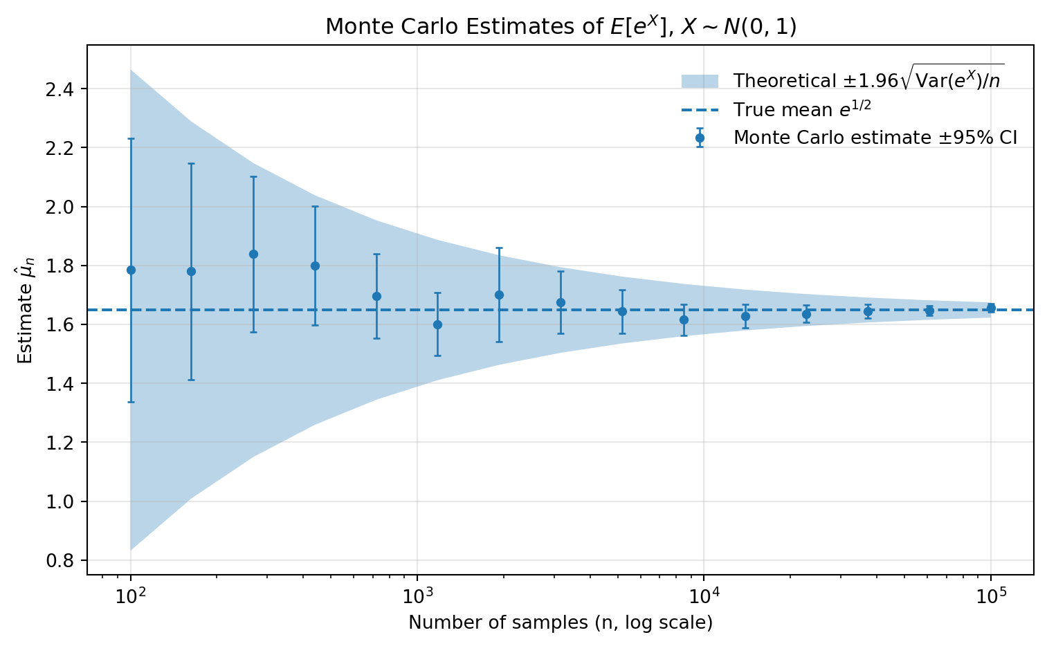
6.3.10 Algorithm 7.48: Monte Carlo Estimation of the CDF with Pointwise Confidence Bands
Direct implementation using n=2000 samples:
Show code generating the plot below
import numpy as np
import matplotlib.pyplot as plt
from scipy.stats import expon, norm
# -----------------------------
# 1) Inputs
# -----------------------------
n = 2000
m = 100
alpha = 0.05
z = norm.ppf(1 - alpha/2)
# Evaluation grid
x_grid = np.linspace(0, 5, m)
# -----------------------------
# 2) Generate samples
# -----------------------------
X = np.empty(n)
for i in range(n):
X[i] = np.random.exponential(scale=1.0)
# -----------------------------
# 3) Compute ECDF + SE
# -----------------------------
F_hat = np.zeros(m)
se = np.zeros(m)
for j in range(m):
count = 0
for i in range(n):
if X[i] <= x_grid[j]:
count += 1
F_hat[j] = count / n
se[j] = np.sqrt(F_hat[j] * (1 - F_hat[j]) / n)
# -----------------------------
# 4) Confidence bands
# -----------------------------
ci_low = F_hat - z * se
ci_high = F_hat + z * se
# -----------------------------
# 5) True CDF
# -----------------------------
F_true = expon.cdf(x_grid, scale=1.0)
# -----------------------------
# 6) Plot
# -----------------------------
plt.figure(figsize=(7, 5))
plt.plot(x_grid, F_hat, label="Estimated CDF")
plt.plot(x_grid, F_true, linestyle="--", label="True CDF")
plt.fill_between(
x_grid,
ci_low,
ci_high,
alpha=0.3,
label="95% confidence band"
)
plt.xlabel("x")
plt.ylabel("F(x)")
plt.title("Monte Carlo CDF Estimate with Confidence Bands (Exp(1))")
plt.legend(frameon=False)
plt.grid(alpha=0.3)
plt.tight_layout()
plt.show()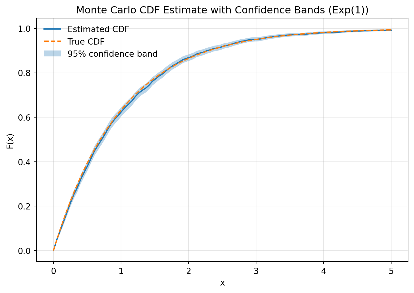
Interactive version:
Show code generating the plot below
import numpy as np
import pandas as pd
import altair as alt
alt.data_transformers.enable("vegafusion")
# -----------------------------
# 1) Parameters + slider
# -----------------------------
n_values = np.arange(100, 5100, 100)
n_slider = alt.param(
name="n",
value=200,
bind=alt.binding_range(
min=n_values.min(),
max=n_values.max(),
step=100,
name="Samples: "
)
)
# Fixed grid size
m = 150
x_grid = np.linspace(0, 5, m)
# -----------------------------
# 2) Generate maximum sample
# -----------------------------
N_max = n_values.max()
X = np.random.exponential(scale=1.0, size=N_max)
# -----------------------------
# 3) Precompute ECDF
# -----------------------------
records = []
for n in n_values:
X_n = X[:n]
for x in x_grid:
F_hat = np.mean(X_n <= x)
se = np.sqrt(F_hat * (1 - F_hat) / n)
records.append({
"n": n,
"x": x,
"F_hat": F_hat,
"ci_low": F_hat - 1.96 * se,
"ci_high": F_hat + 1.96 * se,
"F_true": 1 - np.exp(-x)
})
df = pd.DataFrame(records)
# -----------------------------
# 4) Base filter
# -----------------------------
base = alt.Chart(df).transform_filter(
"datum.n == n"
)
# -----------------------------
# 5) Confidence band
# -----------------------------
band = base.mark_area(opacity=0.3).encode(
x=alt.X("x:Q", title="x"),
y=alt.Y("ci_low:Q"),
y2=alt.Y2("ci_high:Q"),
color=alt.value("#4a90e2")
)
# -----------------------------
# 6) Estimated CDF
# -----------------------------
cdf_line = base.mark_line().encode(
x="x:Q",
y=alt.Y("F_hat:Q", title="F(x)", scale=alt.Scale(domain=[0, 1])),
color=alt.value("#2672c9")
)
# -----------------------------
# 7) True CDF
# -----------------------------
true_line = base.mark_line(strokeDash=[5,5]).encode(
x="x:Q",
y="F_true:Q",
color=alt.value("orange")
)
# -----------------------------
# 8) Legend construction (manual)
# -----------------------------
legend_df = pd.DataFrame({
"label": ["Estimated CDF", "True CDF", "Confidence band"],
"color": ["#2672c9", "orange", "#4a90e2"]
})
legend = alt.Chart(legend_df).mark_point(filled=True, size=100).encode(
y=alt.Y("label:N", axis=alt.Axis(title=None)),
color=alt.Color("color:N", scale=None)
).properties(
width=50,
height=100
)
# -----------------------------
# 9) Combine
# -----------------------------
chart = alt.hconcat(
(band + cdf_line + true_line).add_params(n_slider).properties(
width=500,
height=400,
title="Monte Carlo ECDF with Confidence Bands (Exp(1))"
),
legend
)
chart6.3.11 Example 7.51: Newsvendor problem
Figure 7.7:
Show code generating the plot below
import numpy as np
import matplotlib.pyplot as plt
# -----------------------------
# 1) Inputs
# -----------------------------
p = 75 # unit price
c = 30 # cost
s = 10 # salvage value
alpha = 500
sigma = 1
n = 5000
# Grid of order quantities
q_grid = np.linspace(0, 1000, 100)
# -----------------------------
# 2) Generate demand samples
# -----------------------------
D = np.zeros(n)
for i in range(n):
eps = np.random.normal(0, sigma)
D[i] = max(alpha * (1 + eps), 0)
# -----------------------------
# 3) Monte Carlo profit
# -----------------------------
mc_profit = []
for q in q_grid:
profits = []
for i in range(n):
demand = D[i]
sold = min(q, demand)
leftover = max(q - demand, 0)
pi = p * sold + s * leftover - c * q
profits.append(pi)
mc_profit.append(np.mean(profits))
mc_profit = np.array(mc_profit)
# -----------------------------
# 4) Deterministic profit
# -----------------------------
det_profit = []
for q in q_grid:
sold = min(q, alpha)
leftover = max(q - alpha, 0)
pi = p * sold + s * leftover - c * q
det_profit.append(pi)
det_profit = np.array(det_profit)
# -----------------------------
# 5) Optimal quantities
# -----------------------------
q_star_mc = q_grid[np.argmax(mc_profit)]
q_star_det = q_grid[np.argmax(det_profit)]
# -----------------------------
# 6) Plot
# -----------------------------
plt.figure(figsize=(8, 5))
# Profit curves
plt.plot(q_grid, mc_profit, label="Monte Carlo profit")
plt.plot(q_grid, det_profit, linestyle="--", label="Deterministic profit")
# Vertical lines
plt.axvline(q_star_mc, linestyle=":", label=f"MC optimum ≈ {q_star_mc:.0f}")
plt.axvline(q_star_det, linestyle=":", label=f"Deterministic optimum ≈ {q_star_det:.0f}")
# Labels
plt.xlabel("Order quantity q")
plt.ylabel("Profit")
plt.title("Newsvendor Problem: Monte Carlo vs Deterministic Profit")
plt.legend(frameon=False)
plt.grid(alpha=0.3)
plt.tight_layout()
plt.show()
Interactive version:
Show code generating the plot below
import numpy as np
import pandas as pd
import altair as alt
alt.data_transformers.enable("vegafusion")
# -----------------------------
# 1) Parameters + slider
# -----------------------------
p = 75 # unit price
c = 30 # cost
s = 10 # salvage value
alpha = 500
n = 5000
q_grid = np.linspace(0, 1000, 100)
# sigma_values = np.round(np.linspace(0.2, 2, 10), 2)
sigma_step = 0.2
sigma_values = np.round(np.arange(0.2, 2, sigma_step), 2)
sigma_slider = alt.param(
name="sigma",
value=0.2,
bind=alt.binding_range(
min=sigma_values.min(),
max=sigma_values.max(),
step=sigma_step, #0.05,
name="σ: "
)
)
# -----------------------------
# 2) Precompute simulations
# -----------------------------
records = []
opt_records = []
for sigma in sigma_values:
eps = np.random.normal(0, sigma, n)
D = np.maximum(alpha * (1 + eps), 0)
profits_q = []
for q in q_grid:
sold = np.minimum(q, D)
leftover = np.maximum(q - D, 0)
profit = np.mean(p * sold + s * leftover - c * q)
profits_q.append(profit)
records.append({
"q": q,
"sigma": sigma,
"profit": profit
})
profits_q = np.array(profits_q)
q_star = q_grid[np.argmax(profits_q)]
opt_records.append({
"sigma": sigma,
"q_star": q_star
})
df = pd.DataFrame(records)
df_opt = pd.DataFrame(opt_records)
# -----------------------------
# 3) Deterministic curve
# -----------------------------
det_profit = []
for q in q_grid:
sold = min(q, alpha)
leftover = max(q - alpha, 0)
det_profit.append(p * sold + s * leftover - c * q)
df_det = pd.DataFrame({
"q": q_grid,
"profit": det_profit
})
q_star_det = q_grid[np.argmax(det_profit)]
# -----------------------------
# 4) Charts
# -----------------------------
base = alt.Chart(df).transform_filter(
"datum.sigma == sigma"
)
mc_line = base.mark_line().encode(
x=alt.X("q:Q", title="Order quantity q"),
y=alt.Y("profit:Q", title="Profit")
)
det_line = alt.Chart(df_det).mark_line(strokeDash=[5,5]).encode(
x="q:Q",
y="profit:Q"
)
# MC optimal q
mc_rule = alt.Chart(df_opt).transform_filter(
"datum.sigma == sigma"
).mark_rule().encode(
x="q_star:Q"
)
# Deterministic optimal q
det_rule = alt.Chart(pd.DataFrame({"q":[q_star_det]})).mark_rule(strokeDash=[2,2]).encode(
x="q:Q"
)
# Labels
mc_text = alt.Chart(df_opt).transform_filter(
"datum.sigma == sigma"
).mark_text(
align="left",
dx=5,
dy=-5,
fontSize=12
).encode(
x="q_star:Q",
y=alt.value(20), # fixed vertical position
text=alt.Text("q_star:Q", format=".0f")
)
det_text_df = pd.DataFrame({
"q": [q_star_det]
})
det_text = alt.Chart(det_text_df).mark_text(
align="left",
dx=5,
dy=10,
fontSize=12
).encode(
x="q:Q",
y=alt.value(40),
text=alt.Text("q:Q", format=".0f")
)
mc_label = alt.Chart(df_opt).transform_filter(
"datum.sigma == sigma"
).mark_text(
align="left",
dx=5,
dy=-20,
fontSize=11
).encode(
x="q_star:Q",
y=alt.value(20),
text=alt.value("MC")
)
det_label = alt.Chart(det_text_df).mark_text(
align="left",
dx=5,
dy=25,
fontSize=11
).encode(
x="q:Q",
y=alt.value(40),
text=alt.value("Det")
)
# # -----------------------------
# # 5) Combine
# # -----------------------------
chart = (
mc_line
+ det_line
+ mc_rule
+ det_rule
+ mc_text
+ det_text
+ mc_label
+ det_label
).add_params(
sigma_slider
).properties(
width=600,
height=400,
title="Newsvendor: Monte Carlo vs Deterministic Profit"
)
chart6.3.12 Example 7.56: Monopoly pricing
Figure 7.8:
Show code generating the plot below
import numpy as np
import matplotlib.pyplot as plt
# -----------------------------
# 1) Inputs
# -----------------------------
a = 500
b = 8
c = 10
sigma = 0.5
n = 5000
# Price grid
p_grid = np.linspace(c, 50, 100)
# -----------------------------
# 2) Generate shocks
# -----------------------------
eps = np.zeros(n)
for i in range(n):
eps[i] = np.random.normal(0, sigma)
# -----------------------------
# 3) Monte Carlo profit
# -----------------------------
mc_profit = []
for p in p_grid:
profits = []
for i in range(n):
q = max(a * (1 + eps[i]) - b * p, 0)
pi = (p - c) * q
profits.append(pi)
mc_profit.append(np.mean(profits))
mc_profit = np.array(mc_profit)
# -----------------------------
# 4) Deterministic profit
# -----------------------------
det_profit = []
for p in p_grid:
q = max(a - b * p, 0)
det_profit.append((p - c) * q)
det_profit = np.array(det_profit)
# -----------------------------
# 5) Optimal prices
# -----------------------------
p_star_mc = p_grid[np.argmax(mc_profit)]
p_star_det = p_grid[np.argmax(det_profit)]
# -----------------------------
# 6) Plot
# -----------------------------
plt.figure(figsize=(8, 5))
plt.plot(p_grid, mc_profit, label="Monte Carlo profit")
plt.plot(p_grid, det_profit, linestyle="--", label="Deterministic profit")
plt.axvline(p_star_mc, linestyle=":", label=f"MC optimum ≈ {p_star_mc:.1f}")
plt.axvline(p_star_det, linestyle=":", label=f"Deterministic optimum ≈ {p_star_det:.1f}")
plt.xlabel("Price p")
plt.ylabel("Profit")
plt.title("Monopoly Pricing: Monte Carlo vs Deterministic Profit")
plt.legend(frameon=False)
plt.grid(alpha=0.3)
plt.tight_layout()
plt.show()
Interactive version:
Show code generating the plot below
import numpy as np
import pandas as pd
import altair as alt
alt.data_transformers.enable("vegafusion")
# -----------------------------
# 1) Parameters + slider
# -----------------------------
a, b, c = 500, 8, 10
n = 5000
p_grid = np.linspace(c, 50, 100)
sigma_step = 0.1
sigma_values = np.round(np.arange(0.1, 0.7, sigma_step), 2)
sigma_slider = alt.param(
name="sigma",
value=0.4,
bind=alt.binding_range(
min=sigma_values.min(),
max=sigma_values.max(),
step=sigma_step,
name="σ: "
)
)
# -----------------------------
# 2) Precompute simulations
# -----------------------------
records = []
opt_records = []
global_max_profit = -np.inf # for fixing y-axis
for sigma in sigma_values:
eps = np.random.normal(0, sigma, n)
profits_p = []
for p in p_grid:
q = np.maximum(a * (1 + eps) - b * p, 0)
profit = np.mean((p - c) * q)
profits_p.append(profit)
global_max_profit = max(global_max_profit, profit)
records.append({
"p": p,
"sigma": sigma,
"profit": profit
})
profits_p = np.array(profits_p)
p_star = p_grid[np.argmax(profits_p)]
opt_records.append({
"sigma": sigma,
"p_star": p_star
})
df = pd.DataFrame(records)
df_opt = pd.DataFrame(opt_records)
# -----------------------------
# 3) Deterministic benchmark
# -----------------------------
det_profit = []
for p in p_grid:
q = max(a - b * p, 0)
val = (p - c) * q
det_profit.append(val)
global_max_profit = max(global_max_profit, val)
df_det = pd.DataFrame({
"p": p_grid,
"profit": det_profit
})
p_star_det = p_grid[np.argmax(det_profit)]
# -----------------------------
# 4) Charts
# -----------------------------
base = alt.Chart(df).transform_filter(
"abs(datum.sigma - sigma) < 1e-6"
)
mc_line = base.mark_line().encode(
x=alt.X("p:Q", title="Price p"),
y=alt.Y(
"profit:Q",
title="Profit",
scale=alt.Scale(domain=[0, global_max_profit])
)
)
det_line = alt.Chart(df_det).mark_line(strokeDash=[5,5]).encode(
x="p:Q",
y=alt.Y("profit:Q", scale=alt.Scale(domain=[0, global_max_profit]))
)
# MC optimal price
mc_rule = alt.Chart(df_opt).transform_filter(
"abs(datum.sigma - sigma) < 1e-6"
).mark_rule().encode(
x="p_star:Q"
)
# Deterministic optimal price
det_rule = alt.Chart(pd.DataFrame({"p":[p_star_det]})).mark_rule(
strokeDash=[2,2]
).encode(
x="p:Q"
)
# Labels: values
mc_text = alt.Chart(df_opt).transform_filter(
"abs(datum.sigma - sigma) < 1e-6"
).mark_text(
align="left",
dx=5,
dy=-5,
fontSize=12
).encode(
x="p_star:Q",
y=alt.value(20),
text=alt.Text("p_star:Q", format=".1f")
)
det_text = alt.Chart(pd.DataFrame({"p":[p_star_det]})).mark_text(
align="left",
dx=5,
dy=10,
fontSize=12
).encode(
x="p:Q",
y=alt.value(40),
text=alt.Text("p:Q", format=".1f")
)
# Labels: identifiers
mc_label = alt.Chart(df_opt).transform_filter(
"abs(datum.sigma - sigma) < 1e-6"
).mark_text(
align="left",
dx=5,
dy=-20,
fontSize=11
).encode(
x="p_star:Q",
y=alt.value(20),
text=alt.value("MC")
)
det_label = alt.Chart(pd.DataFrame({"p":[p_star_det]})).mark_text(
align="left",
dx=5,
dy=25,
fontSize=11
).encode(
x="p:Q",
y=alt.value(40),
text=alt.value("Det")
)
# -----------------------------
# 5) Combine
# -----------------------------
chart = (
mc_line
+ det_line
+ mc_rule
+ det_rule
+ mc_text
+ det_text
+ mc_label
+ det_label
).add_params(
sigma_slider
).properties(
width=600,
height=400,
title="Monopoly Pricing: Monte Carlo vs Deterministic Profit"
)
chart6.3.13 Example 7.62: Portfolio choice
Figure 7.9:
Show code generating the plot below
import numpy as np
import matplotlib.pyplot as plt
# -----------------------------
# 1) Inputs
# -----------------------------
mu = 0.10
sigma = 0.35
Rf = 0.02
n = 300000
# Utility (log utility)
U = lambda w: np.log(w)
# Grid for portfolio share
w_grid = np.linspace(0, 1, 100)
# -----------------------------
# 2) Simulate returns
# -----------------------------
R = np.zeros(n)
for i in range(n):
R[i] = np.random.normal(mu, sigma)
# -----------------------------
# 3) Monte Carlo loop
# -----------------------------
mean_utility = []
ci_low = []
ci_high = []
for w in w_grid:
utilities = []
for i in range(n):
W = (1 - w) * (1 + Rf) + w * (1 + R[i])
W = max(W, 1e-8) ## INTRODUCED CLIPPING!!
utilities.append(U(W))
utilities = np.array(utilities)
mu_hat = np.mean(utilities)
std_hat = np.std(utilities, ddof=1)
se = std_hat / np.sqrt(n)
mean_utility.append(mu_hat)
ci_low.append(mu_hat - 1.96 * se)
ci_high.append(mu_hat + 1.96 * se)
mean_utility = np.array(mean_utility)
ci_low = np.array(ci_low)
ci_high = np.array(ci_high)
# -----------------------------
# 4) Optimal shares
# -----------------------------
w_star_mc = w_grid[np.argmax(mean_utility)]
# Analytical approximation
w_star_det = (mu - Rf) / sigma**2
# -----------------------------
# 5) Plot
# -----------------------------
plt.figure(figsize=(8,5))
plt.plot(w_grid, mean_utility, label="Monte Carlo expected utility")
plt.fill_between(w_grid, ci_low, ci_high, alpha=0.2, label="95% CI")
plt.axvline(w_star_mc, linestyle=":", label=f"MC optimum ≈ {w_star_mc:.2f}")
plt.axvline(w_star_det, linestyle="--", label=f"Det approx ≈ {w_star_det:.2f}")
plt.xlabel("Investment share w")
plt.ylabel("Expected utility")
plt.title("Portfolio Choice: Monte Carlo Expected Utility")
plt.legend(frameon=False)
plt.grid(alpha=0.3)
plt.tight_layout()
plt.show()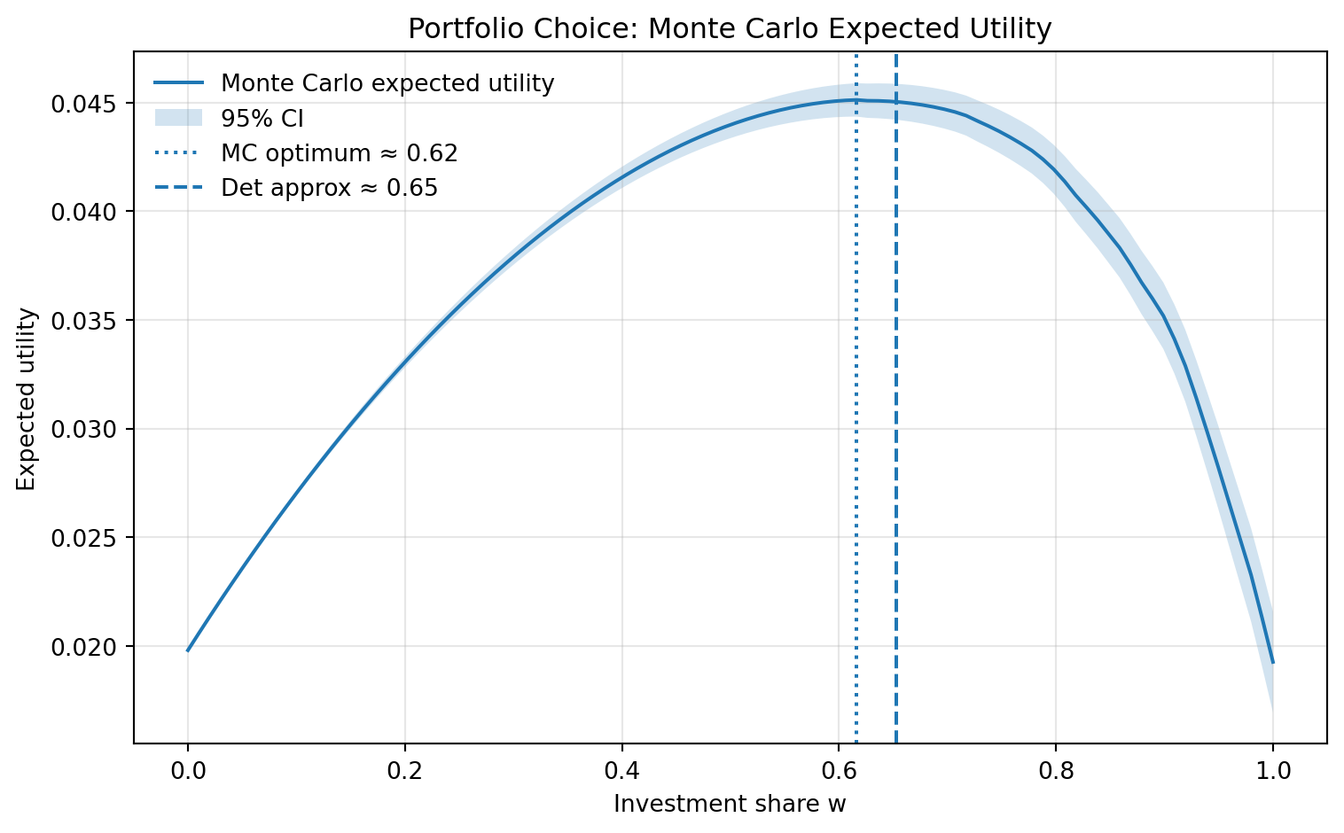
Interactive version:
Show code generating the plot below
import numpy as np
import pandas as pd
import altair as alt
alt.data_transformers.enable("vegafusion")
# -----------------------------
# 1) Parameters + discrete grids
# -----------------------------
Rf = 0.02
n = 100000
mu_step = 0.02
sigma_step = 0.05
mu_values = np.round(np.arange(0.04, 0.16, mu_step), 3)
sigma_values = np.round(np.arange(0.3, 0.6, sigma_step), 2)
mu_slider = alt.param(
name="mu",
value=0.10,
bind=alt.binding_range(
min=mu_values.min(),
max=mu_values.max(),
step=mu_step,
name="μ: "
)
)
sigma_slider = alt.param(
name="sigma",
value=0.4,
bind=alt.binding_range(
min=sigma_values.min(),
max=sigma_values.max(),
step=sigma_step,
name="σ: "
)
)
# -----------------------------
# 2) Grid
# -----------------------------
w_grid = np.linspace(0, 1, 100)
def U(x):
return np.log(x)
# -----------------------------
# 3) Precompute simulations
# -----------------------------
records = []
opt_records = []
for mu in mu_values:
for sigma in sigma_values:
R = np.random.normal(mu, sigma, n)
utilities_w = []
for w in w_grid:
W = (1 - w) * (1 + Rf) + w * (1 + R)
W = np.maximum(W, 1e-8) # only log safety
U_vals = U(W)
mu_hat = np.mean(U_vals)
std_hat = np.std(U_vals, ddof=1)
se = std_hat / np.sqrt(n)
records.append({
"w": w,
"mu": mu,
"sigma": sigma,
"mean_u": mu_hat,
"ci_low": mu_hat - 1.96 * se,
"ci_high": mu_hat + 1.96 * se
})
utilities_w.append(mu_hat)
utilities_w = np.array(utilities_w)
w_star = w_grid[np.argmax(utilities_w)]
w_det = (mu - Rf) / sigma**2
opt_records.append({
"mu": mu,
"sigma": sigma,
"w_star": w_star,
"w_det": w_det
})
df = pd.DataFrame(records)
df_opt = pd.DataFrame(opt_records)
# -----------------------------
# 4) Base filtered chart
# -----------------------------
base = alt.Chart(df).transform_filter(
"datum.mu == mu && datum.sigma == sigma"
)
# -----------------------------
# 5) LINE (visual clipping only)
# -----------------------------
line = base.transform_filter(
"datum.mean_u > 0"
).mark_line().encode(
x=alt.X(
"w:Q",
scale=alt.Scale(domain=[0, 1]),
title="Investment share w"
),
y=alt.Y(
"mean_u:Q",
scale=alt.Scale(domain=[0, 0.06]),
title="Expected utility"
)
)
# -----------------------------
# 6) CONFIDENCE BAND (also clipped visually)
# -----------------------------
band = base.transform_filter(
"datum.ci_high > 0"
).mark_area(opacity=0.2).encode(
x="w:Q",
y=alt.Y("ci_low:Q", scale=alt.Scale(domain=[0, 0.06])),
y2="ci_high:Q"
)
# -----------------------------
# 7) OPTIMA
# -----------------------------
opt_base = alt.Chart(df_opt).transform_filter(
"datum.mu == mu && datum.sigma == sigma"
)
mc_rule = opt_base.mark_rule(color="black").encode(
x="w_star:Q"
)
det_rule = opt_base.mark_rule(strokeDash=[5, 5], color="black").encode(
x="w_det:Q"
)
mc_text = opt_base.mark_text(dx=5, dy=-5, fontSize=12).encode(
x="w_star:Q",
y=alt.value(20),
text=alt.Text("w_star:Q", format=".2f")
).transform_calculate(
label="'MC: ' + format(datum.w_star, '.2f')"
).encode(text="label:N")
det_text = opt_base.mark_text(dx=5, dy=10, fontSize=12).encode(
x="w_det:Q",
y=alt.value(40),
text=alt.Text("w_det:Q", format=".2f")
).transform_calculate(
label="'det: ' + format(datum.w_det, '.2f')"
).encode(text="label:N")
# -----------------------------
# 8) COMBINE
# -----------------------------
chart = (
band
+ line
+ mc_rule
+ det_rule
+ mc_text
+ det_text
).add_params(
mu_slider,
sigma_slider
).properties(
width=600,
height=400,
title="Portfolio Choice: Monte Carlo Expected Utility"
)
chart